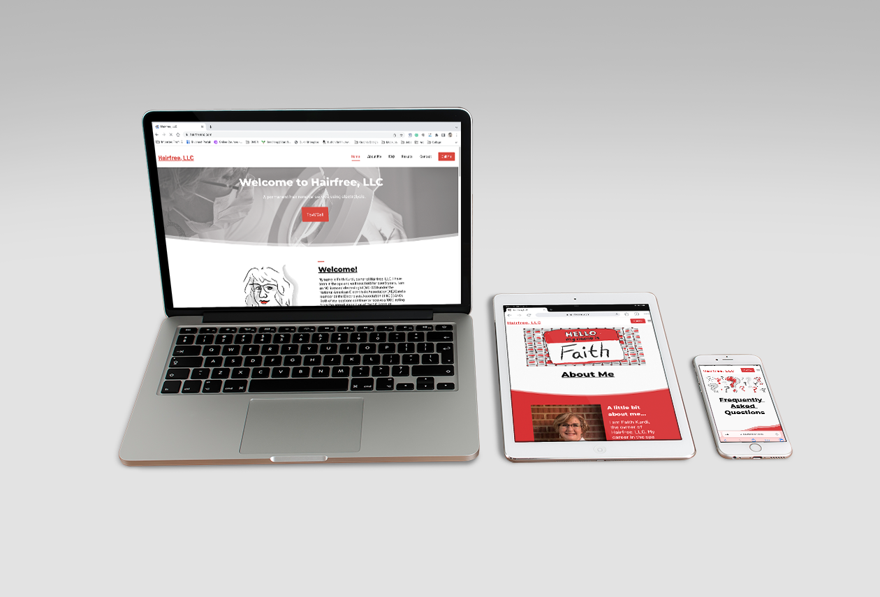
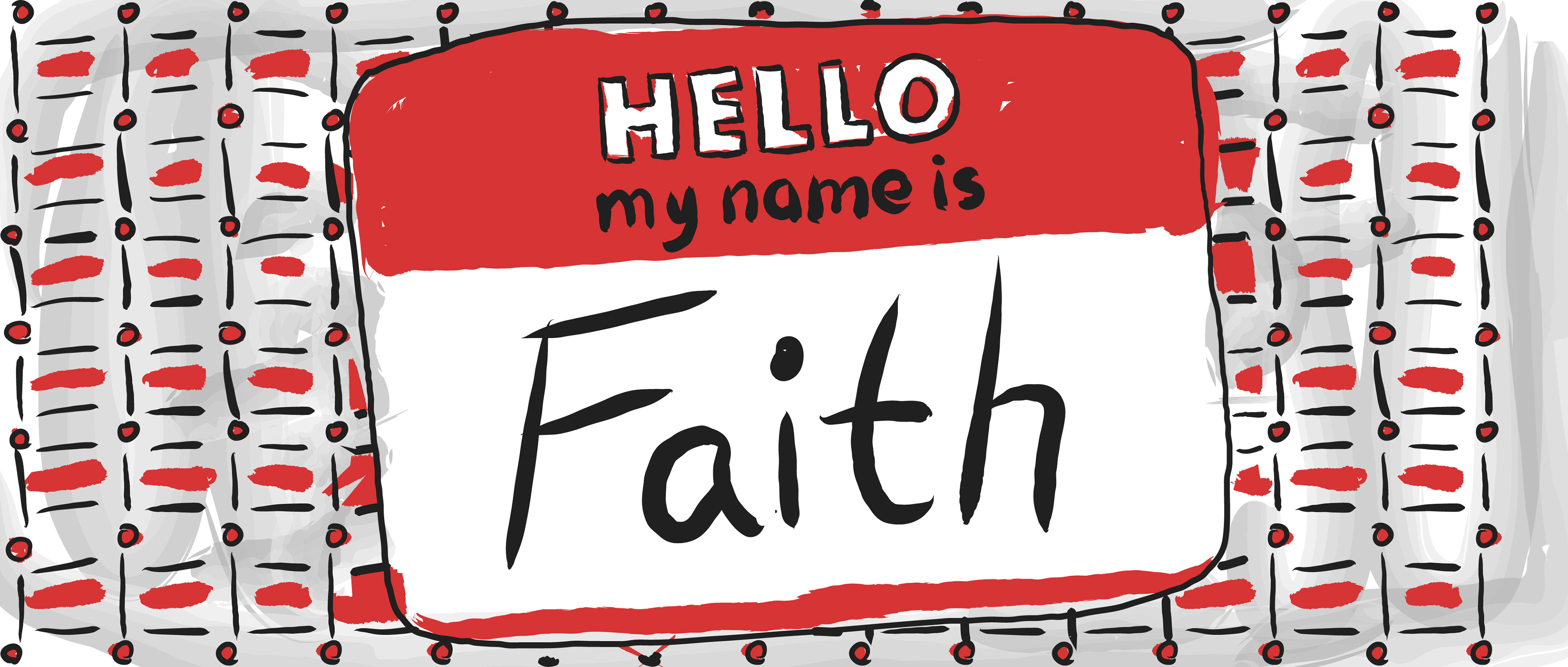
Faith is the owner of a personal haircare business and has been tolerating her previous website for some time. Dealing with it long enough, she approached me to help update her website. She wanted it designed in such a way as to stand out from the norm and to also be appealing to as wide a range of customers as possible. She wanted the tone to be knowledgeable and personable; something informative that was also entertaining.
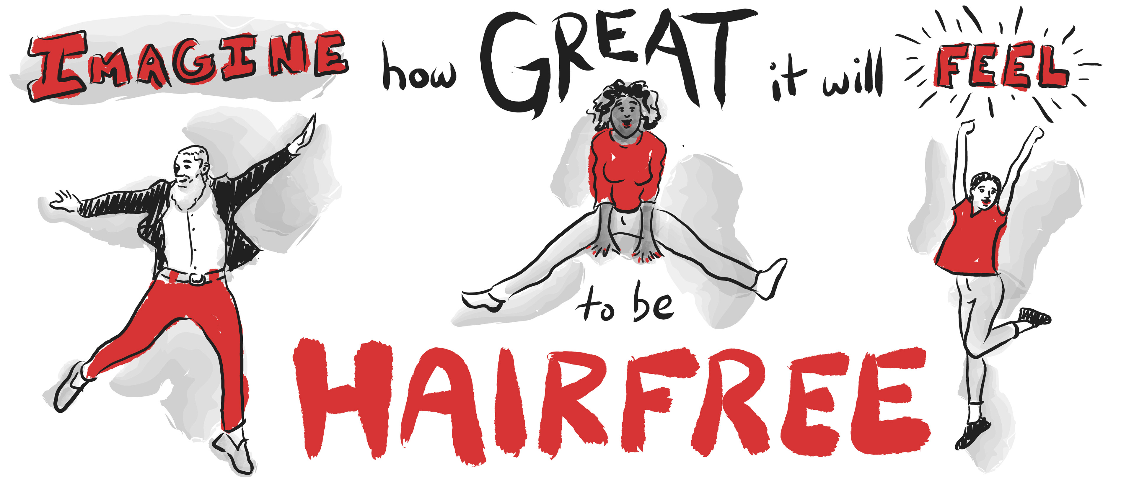
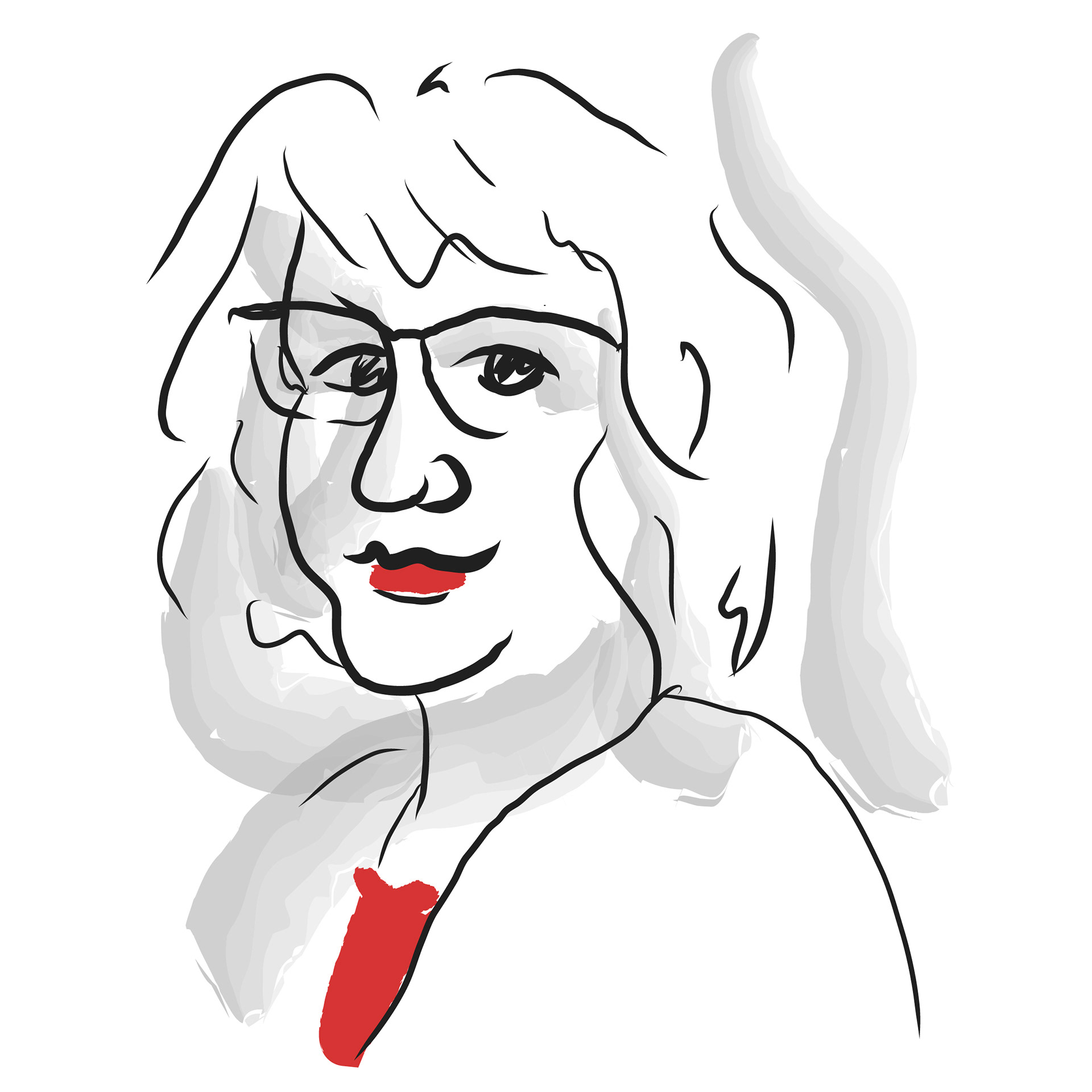
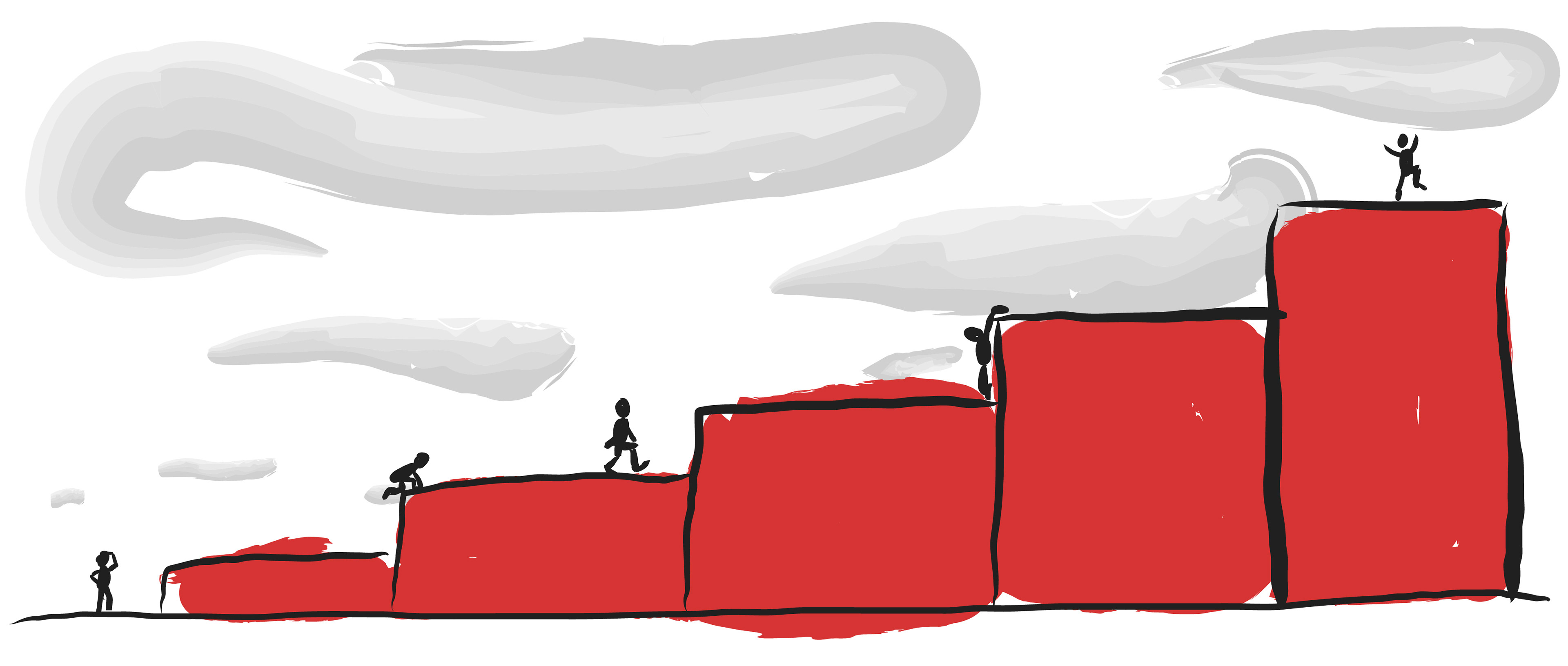
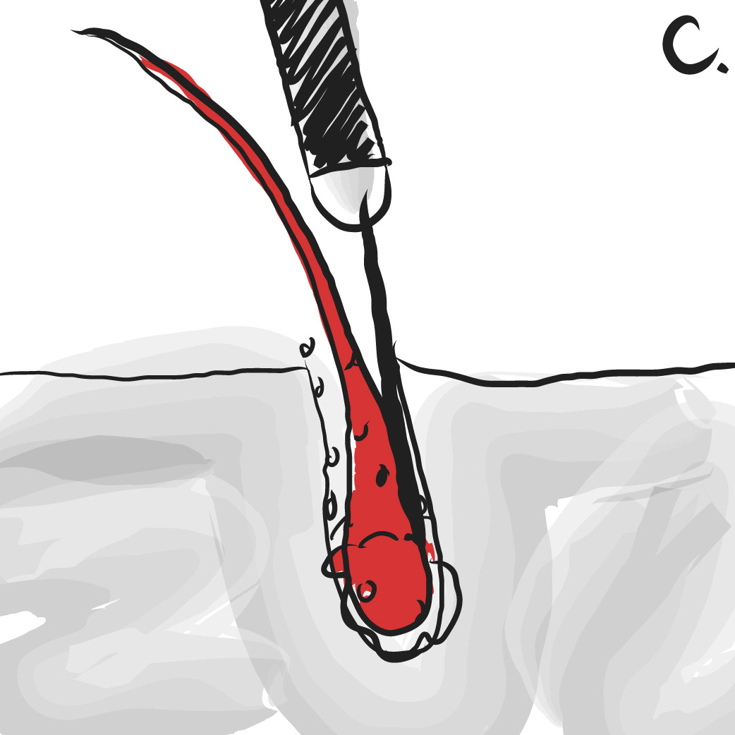
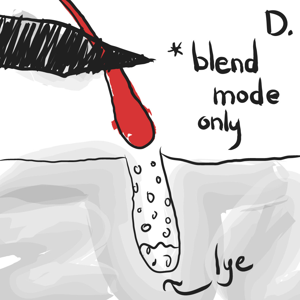
My solution was to design with a unisex approach. After researching the competition and looking through several large-scale health and beauty websites, I began developing a concept that stayed as far away as possible from the beauty care tropes I noticed. To balance the knowledgeable and personable tones that Faith desired, I combined custom illustrations and hand lettering with a professional color palette. To keep the illustrations as inclusive as possible, I focused on depicting concepts rather than people. When drawing people, I accounted for different sexes and skin tones.
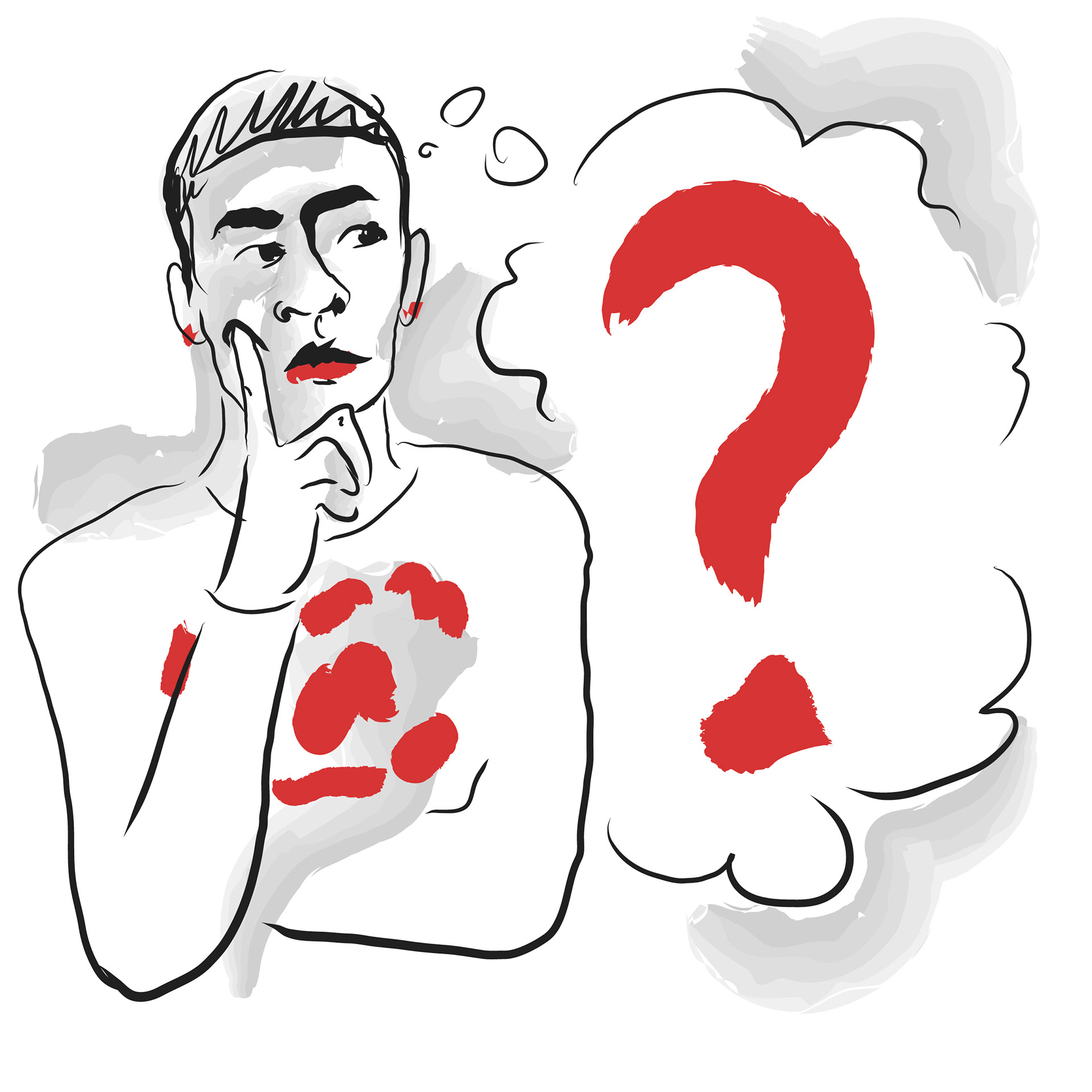

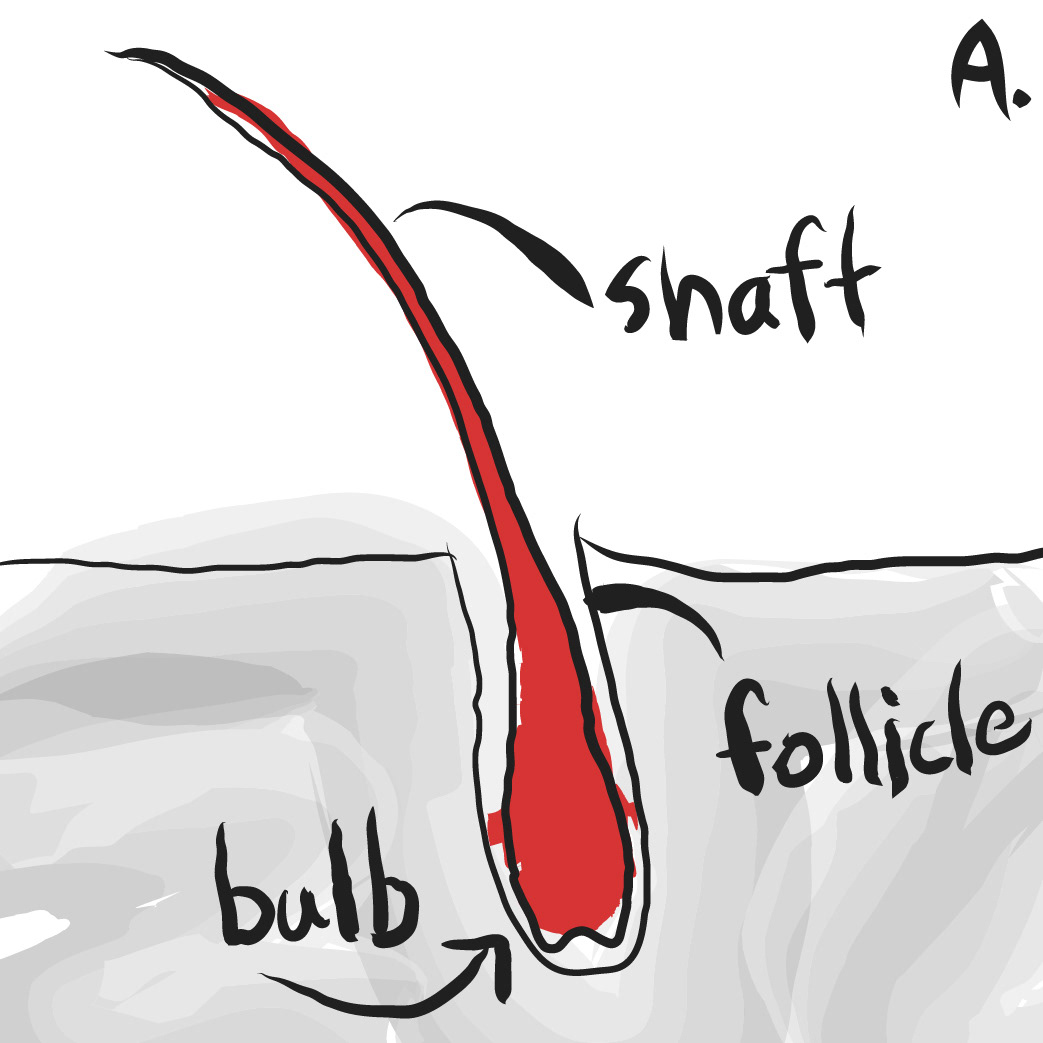
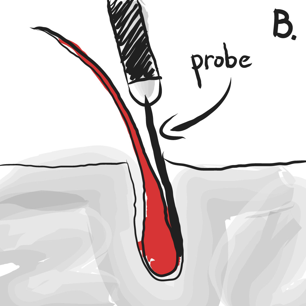
To be informative without being overwhelming, Faith and I collaborated on the copy of the website, balancing education with ease of understanding. My solution was to condense what Faith was telling me into as simple a description as possible, chunk information where appropriate, and incorporate visual elements to better explain concepts.
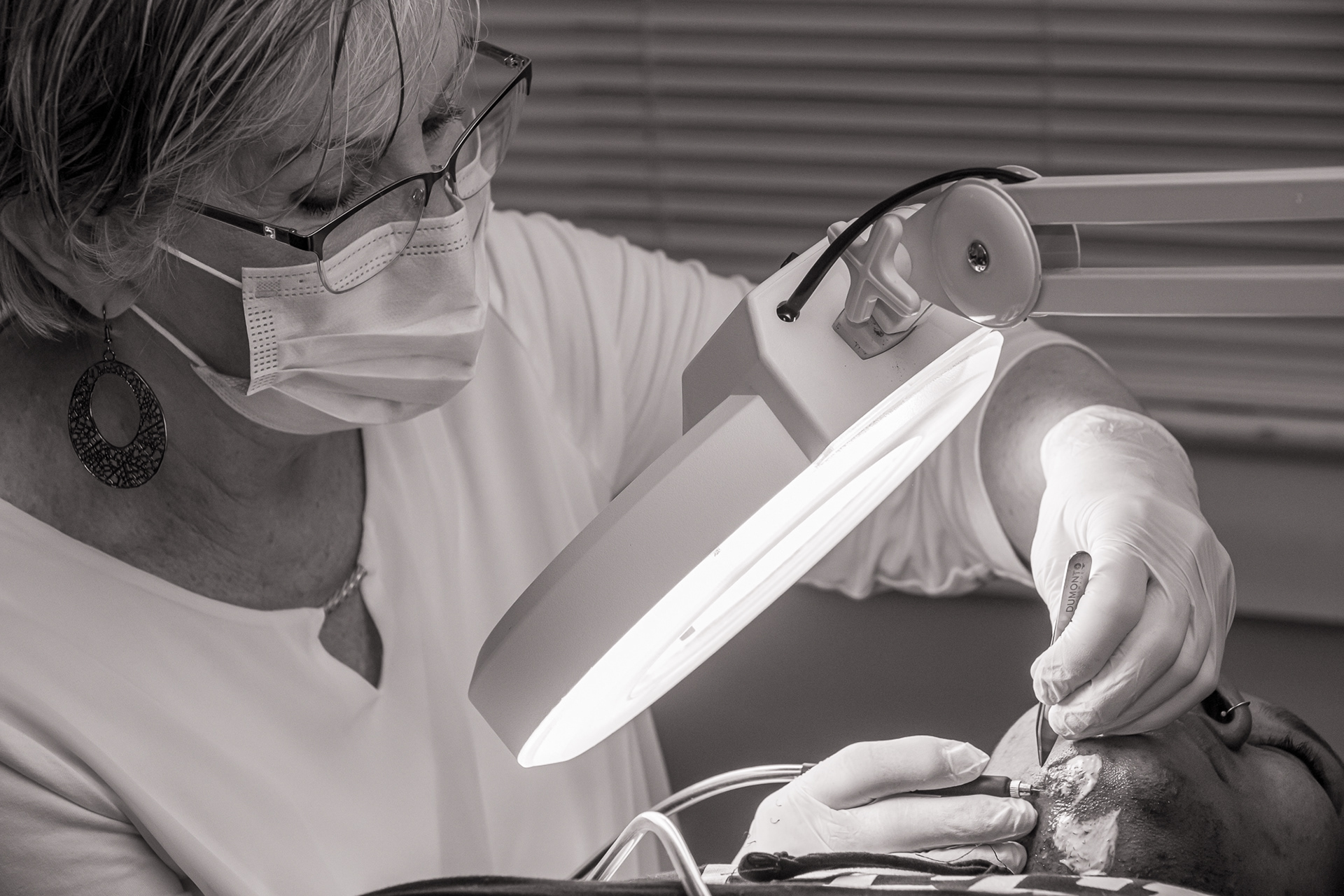
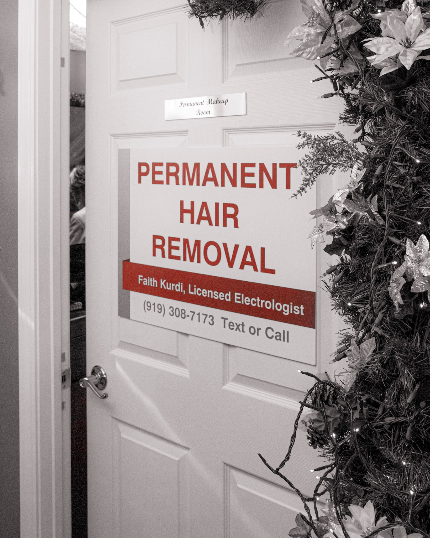
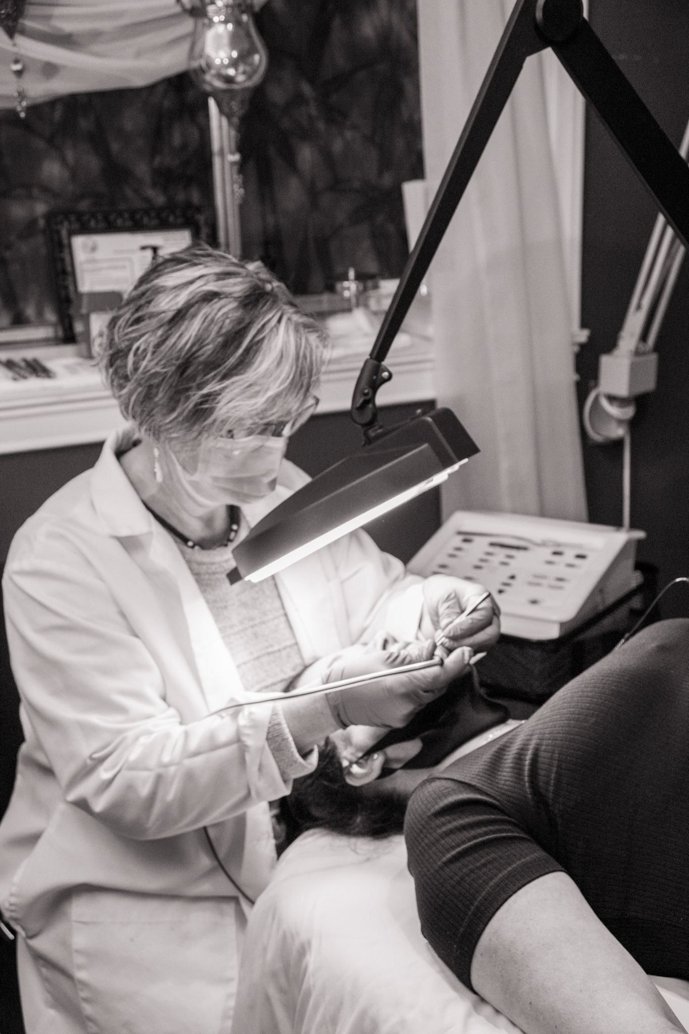
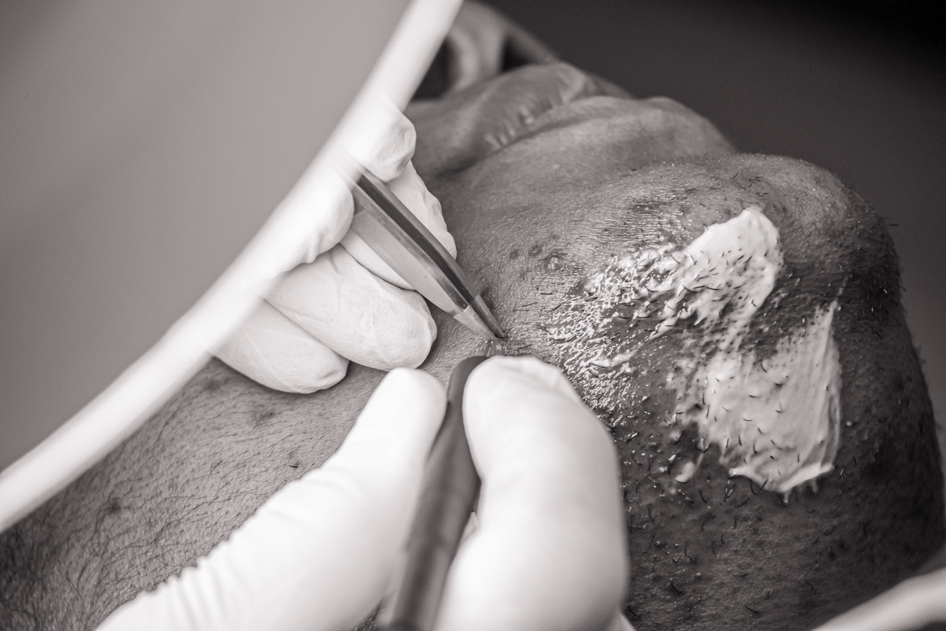
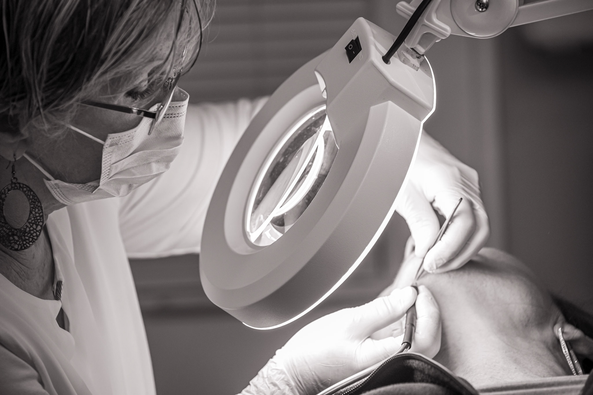
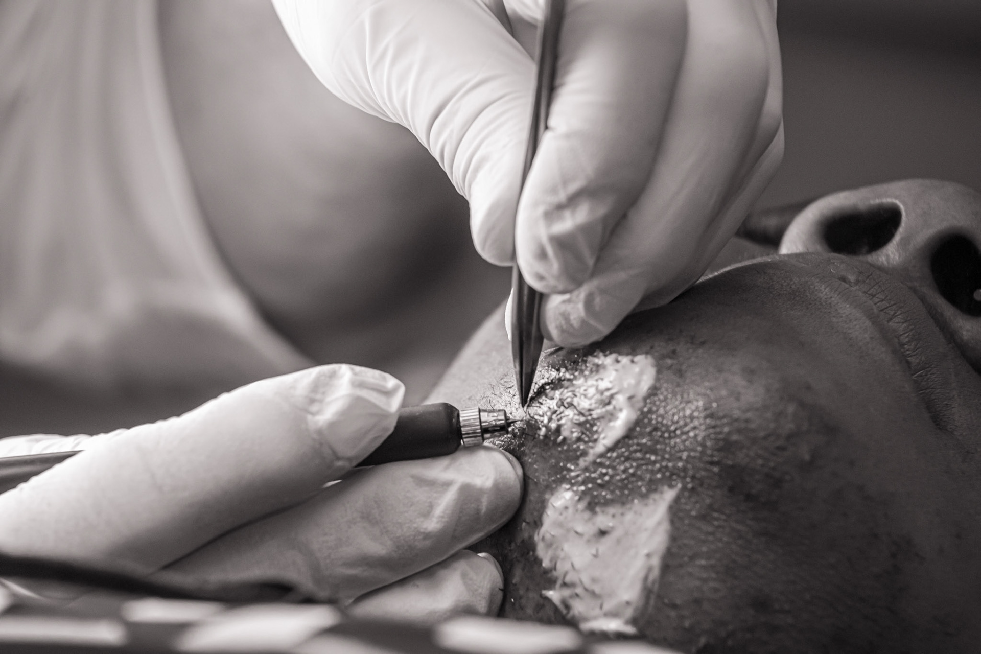
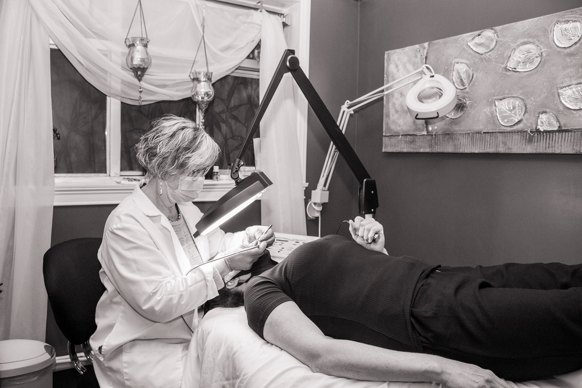
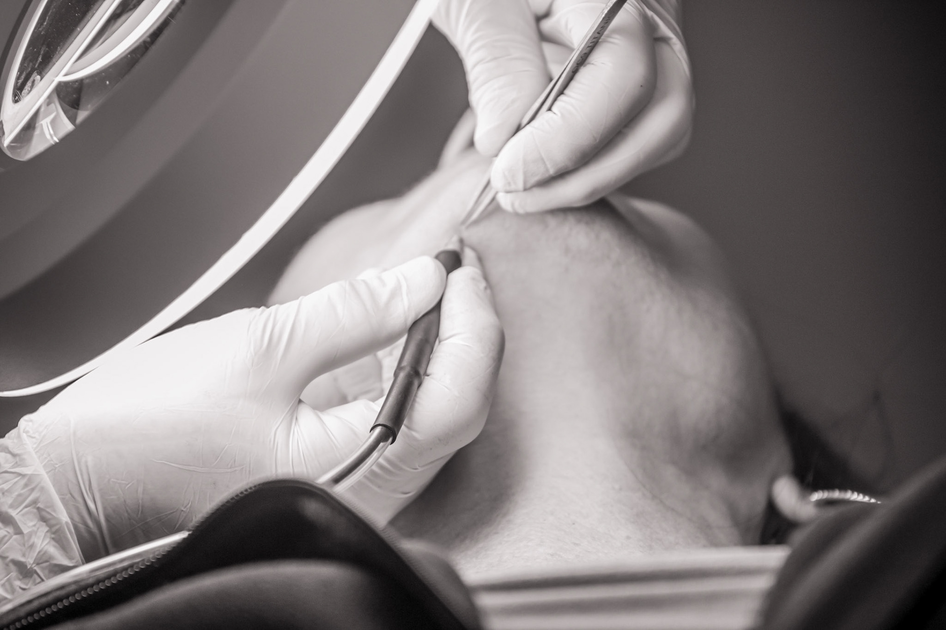
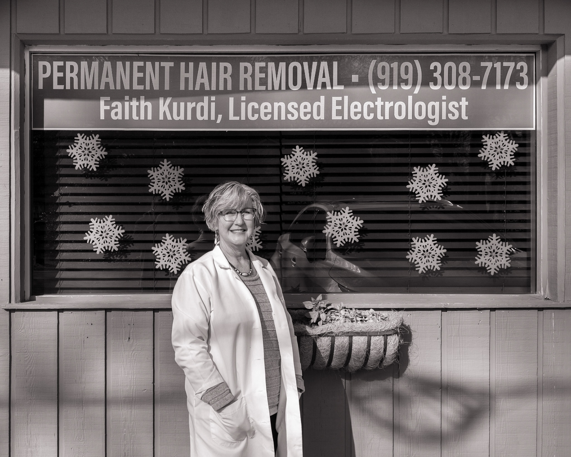
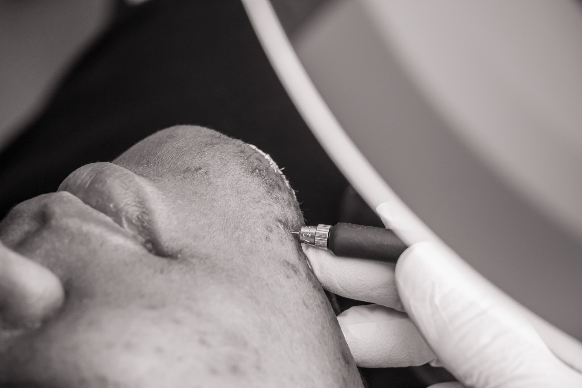
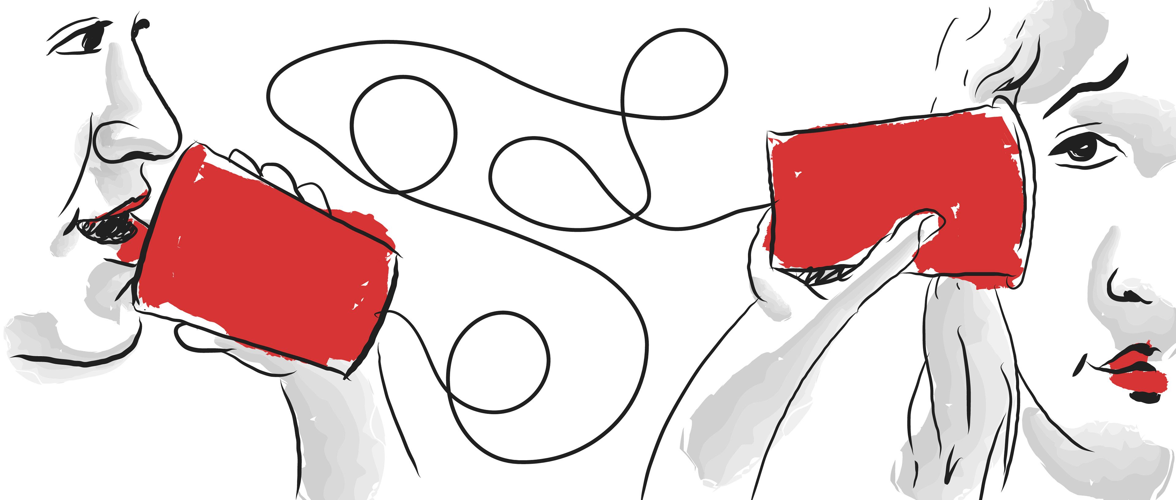
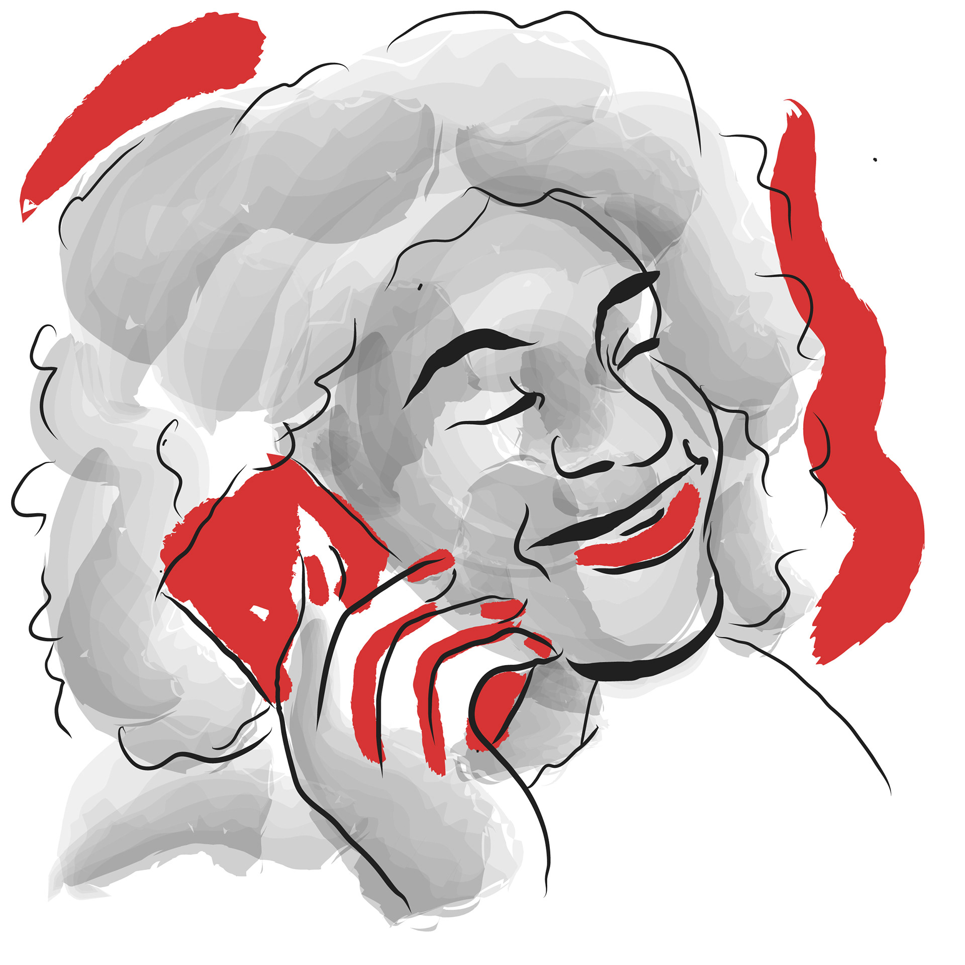
Lastly, photographs were necessary to better explain the process of electrolysis, as well as provide concrete visual examples of who Faith was and what a potentially nervous client could expect. I photographed Faith over the course of several sessions, working with several clients. I decided to use the photographs in grayscale and red to complement the chosen palette.