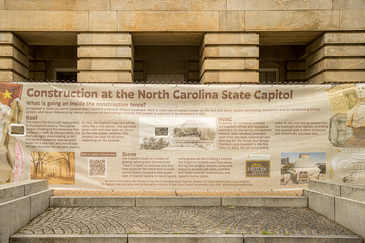
The State Capitol was the active legislative building of North Carolina's state government beginning in 1840, at one point housing offices for the governor, chambers for both the General Assembly and Senate, and other state offices. Most of those entities have since left, and the State Capitol building now serves as a historic site and museum. In its 175+ year history, its copper roof has gone through only three periods of renovation, with the most recent beginning in April 2023. I was approached to design a screen that covers a section of the construction fencing surrounding the building during this period of renovation. The design would include information regarding what renovations were taking place inside the Capitol building while also providing information about the historic structure.
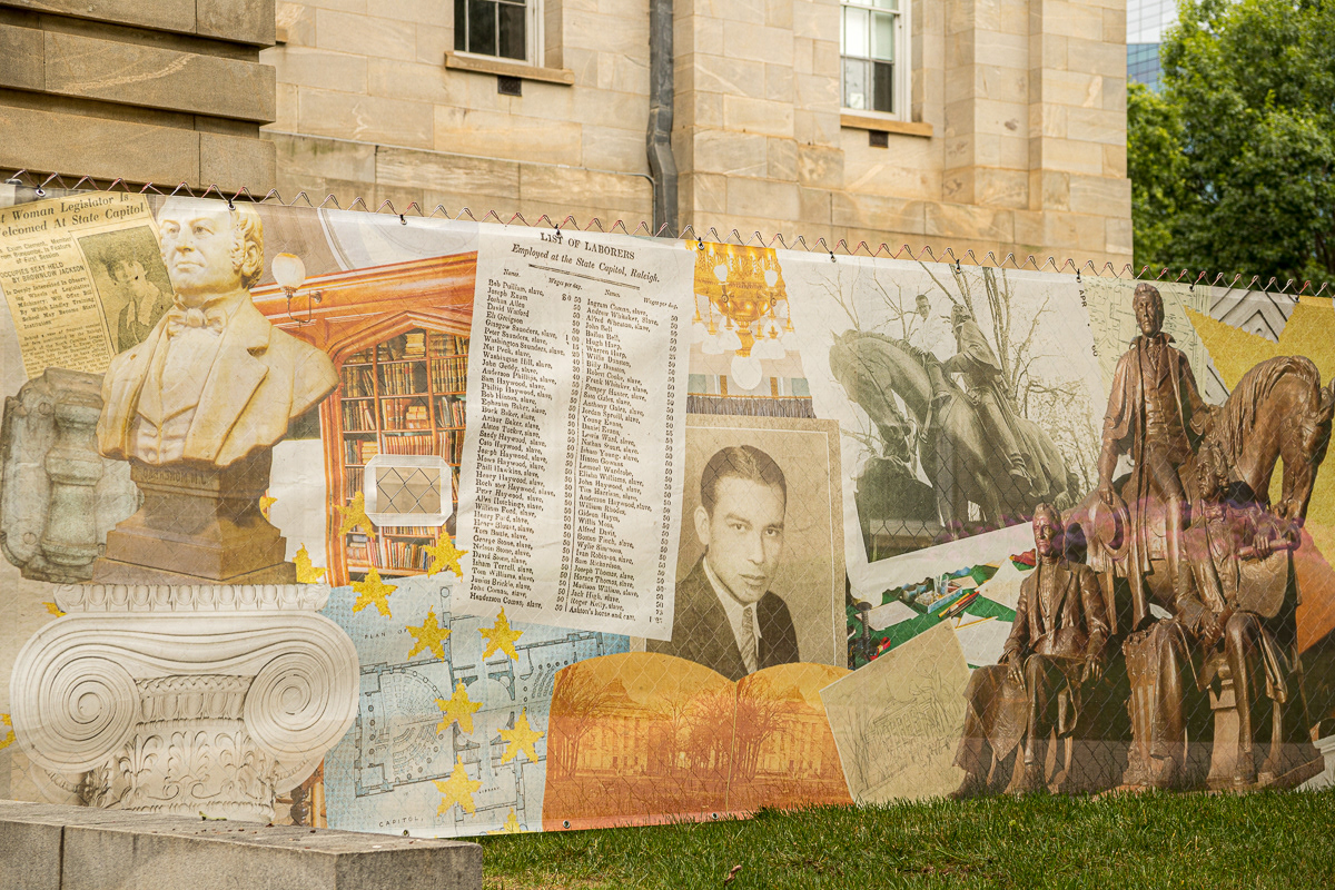
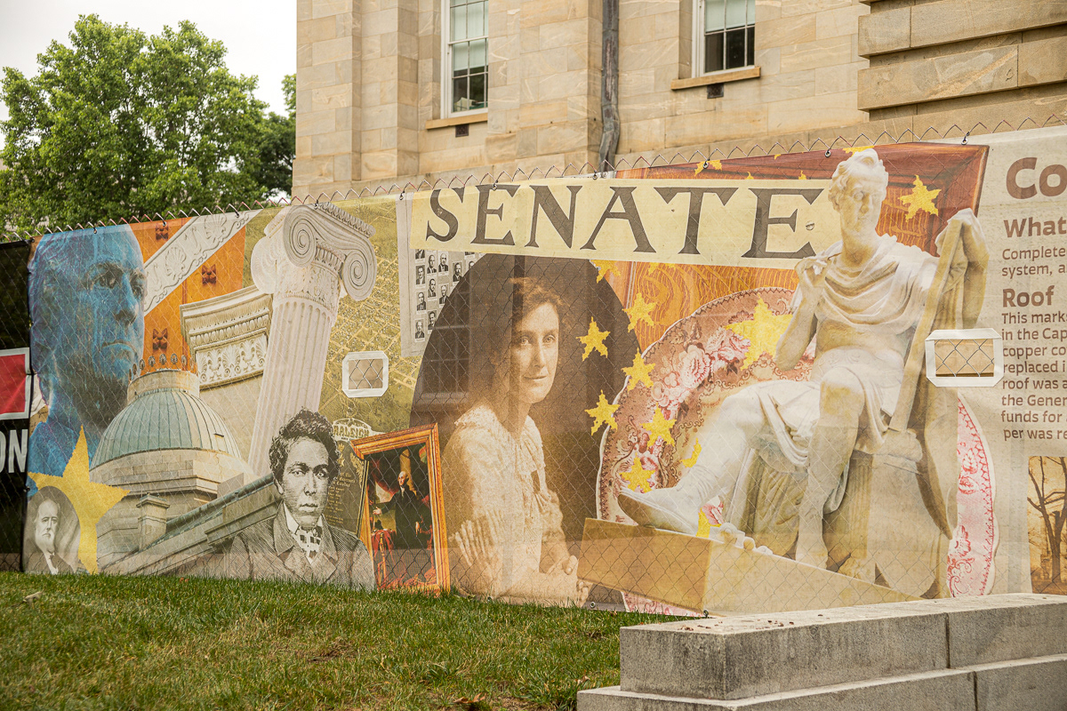
I began by surveying the actual space in which this fence screen would be displayed, noting important viewing angles, and considering any architectural structures that could possibly hinder viewing the copy and imagery. Working with the museum curator, we decided on having the copy centered in the design with collages of imagery flanking it on both sides. I was provided with an immense trove of resources and set out to create a diverse collection of drawings, historic photographs, documents, and several photographs personally taken from which to draw elements for the collage. I wanted a dynamic, eye-catching collage that could spark the interest of passersby, pull them from the streets, and invite them to linger, reading from the copy and learning about the construction work.

Left Side Collage

Right Side Collage
The collage pieces were edited and 'trimmed' in Photoshop. The copy was laid out in InDesign. The composition process for the collage was spontaneous but followed a general concept. I decided to place the focal point of each collage section closest to the center, where the copy is placed, and use the rest of the design to lead the eye there. To unify the design, I overlaid a transparent neutral orange pulled from the coloring of the stone facade of the building and applied some texture to add visual interest and to make the overall design appear slightly aged. These aesthetic choices were made in order to have the design reflect the character of the building and for the design and the building to be in visual harmony with one another in the actual space.


