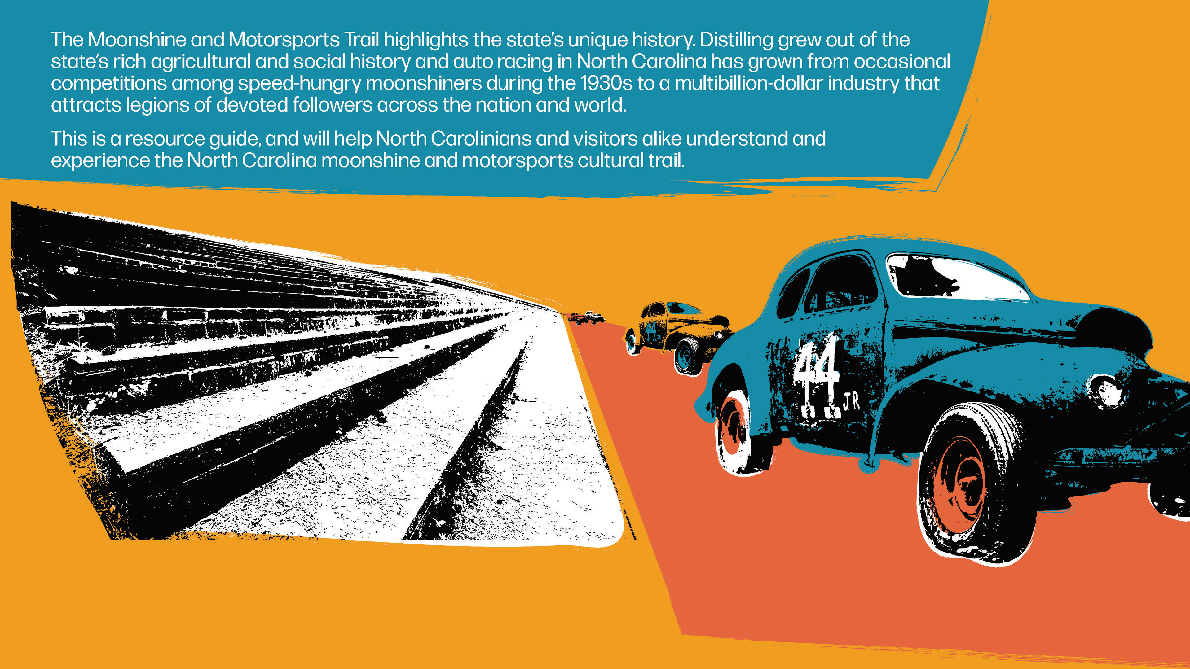
The Moonshine and Motorsports Heritage Trail is a large-scale project created by the North Carolina Department of Natural and Cultural Resources (DNCR). This cultural trail launched in Feb. 2023 as part of The Year of the Trail, an initiative created by the Great Trails State Coalition. The Moonshine and Motorsports Heritage Trail seeks to tell a broader and more complex story of North Carolina's rich distilling and motorsports history. The goals of this trail include promoting rural economic development, educating the public, and instilling a sense of hometown pride.
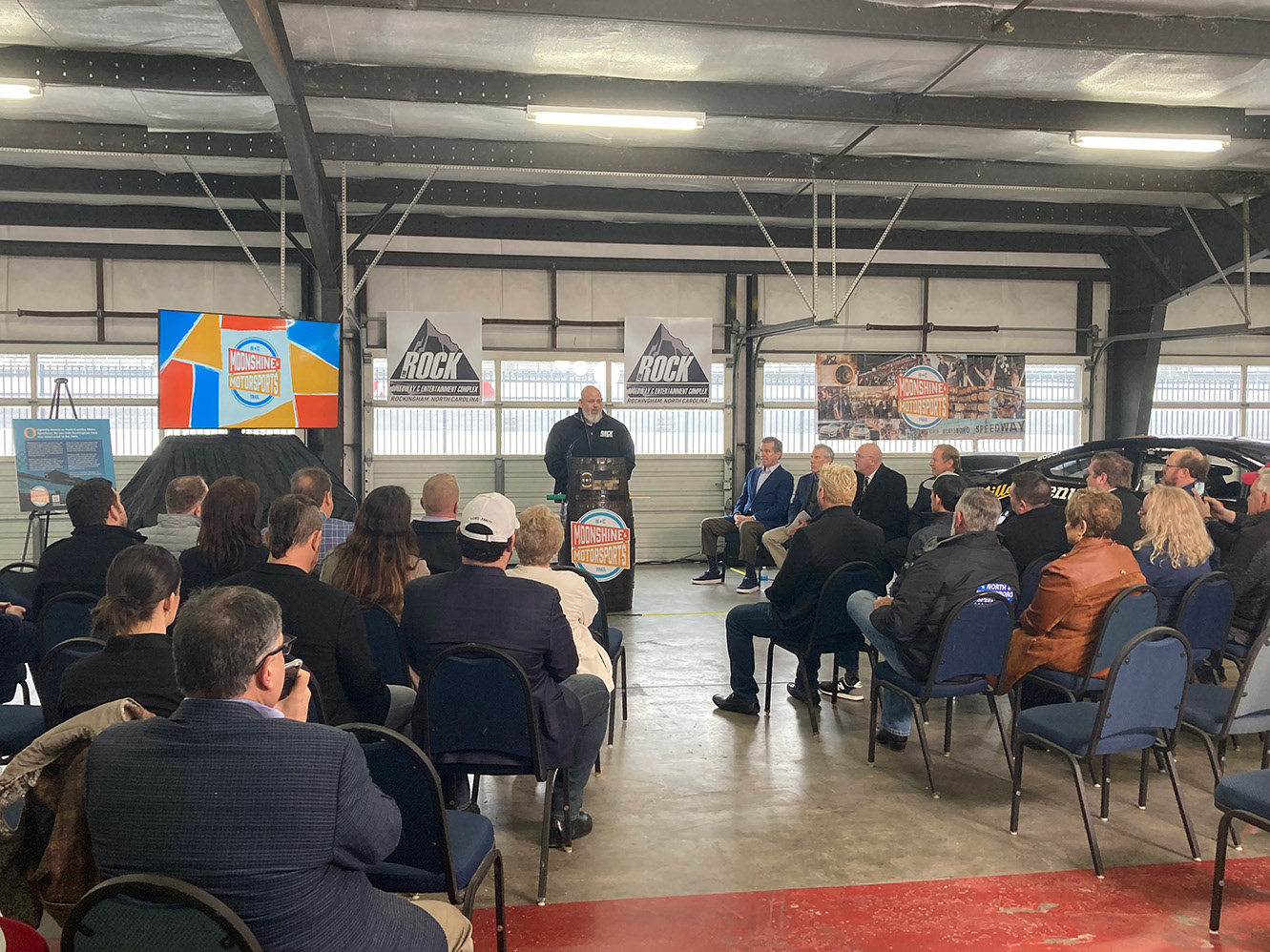
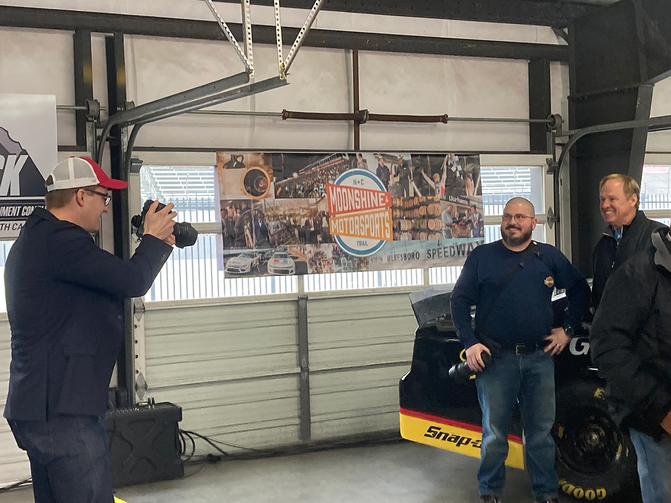
The Moonshine and Motorsports Trail Kickoff Event at Rockingham Speedway
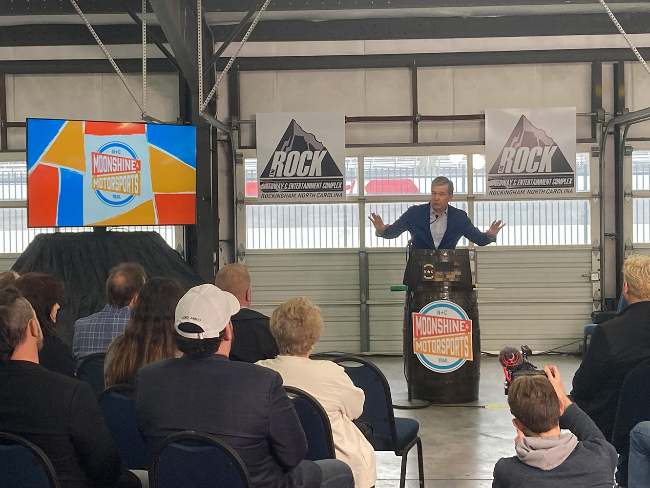
Governor of North Carolina, Roy Cooper delivering remarks

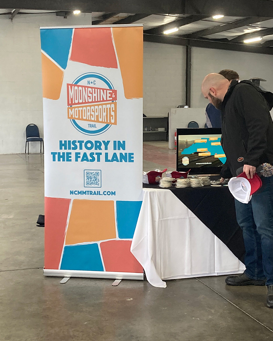
Swag Table
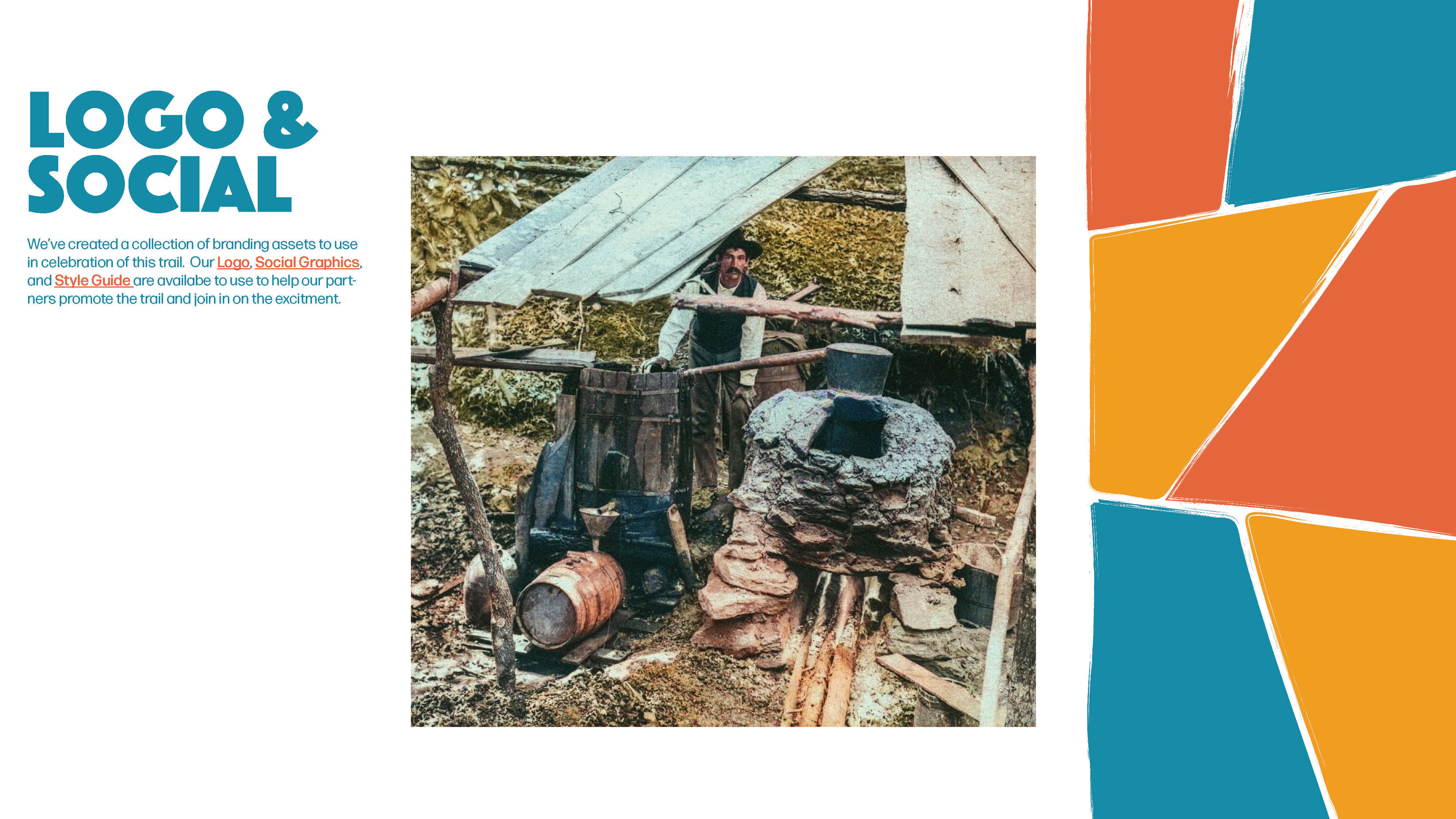
I was given the opportunity to develop the branding for the Moonshine and Motorsports Heritage Trail, incorporating the logo and color palette developed by the creative director. Once finalized, the branding was used in both print and digital applications, ranging from digital ads to billboards placed near historic stock car racing venues throughout North Carolina.
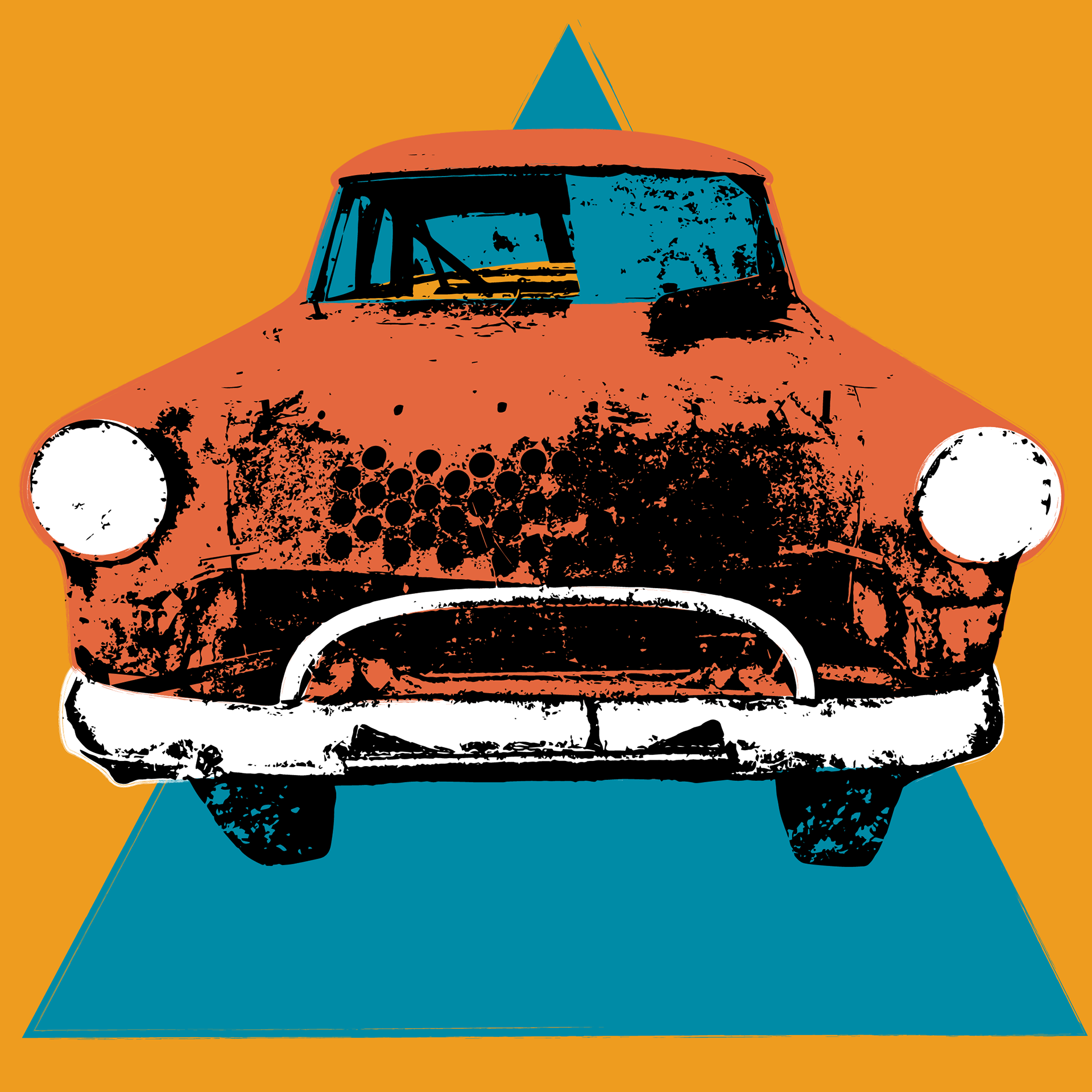
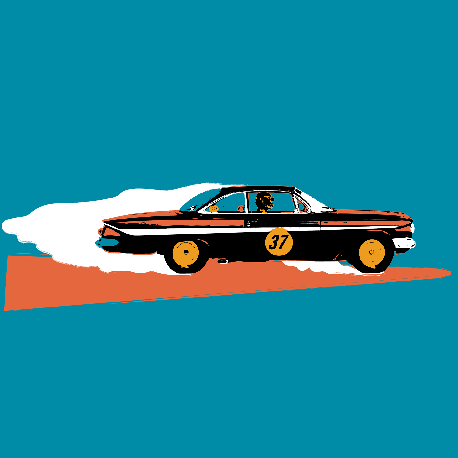
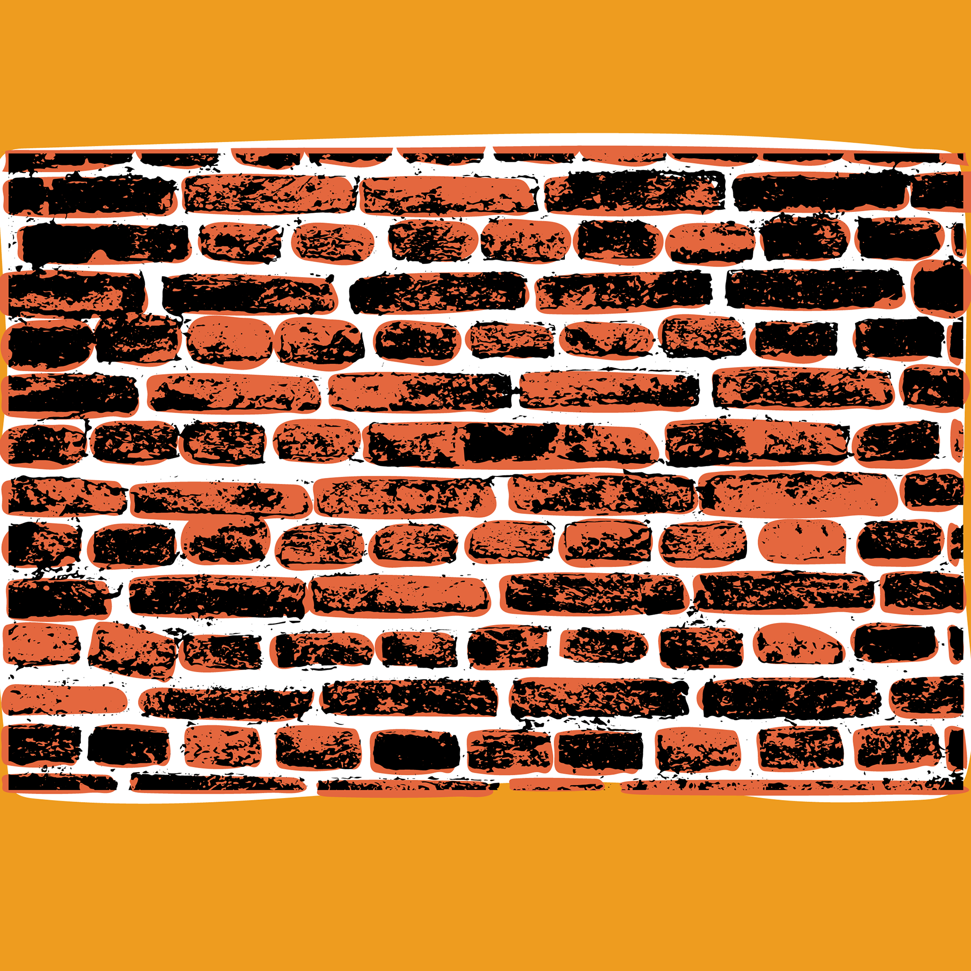
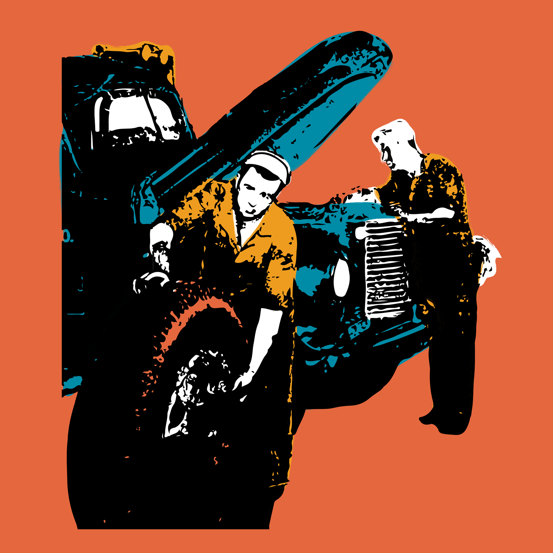
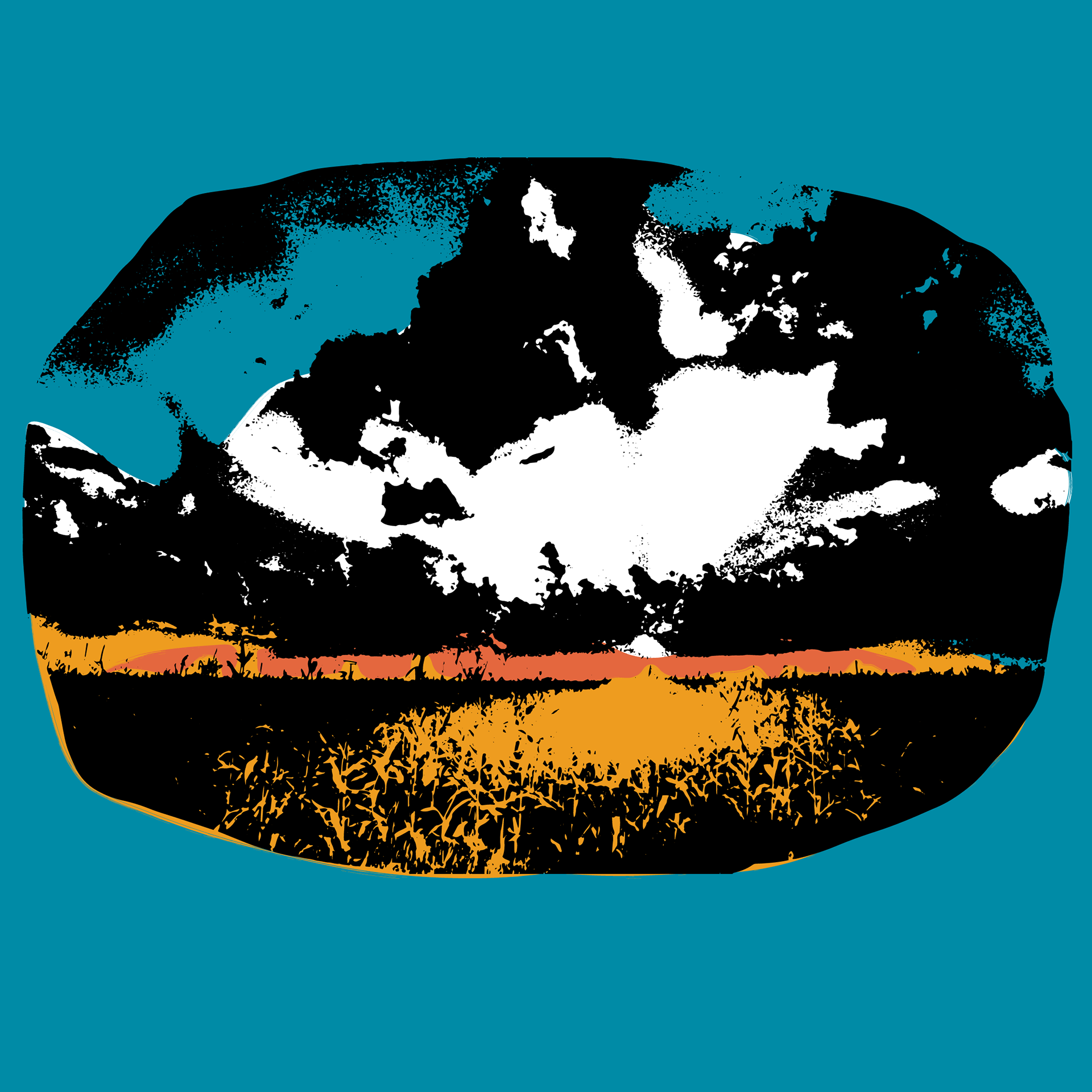
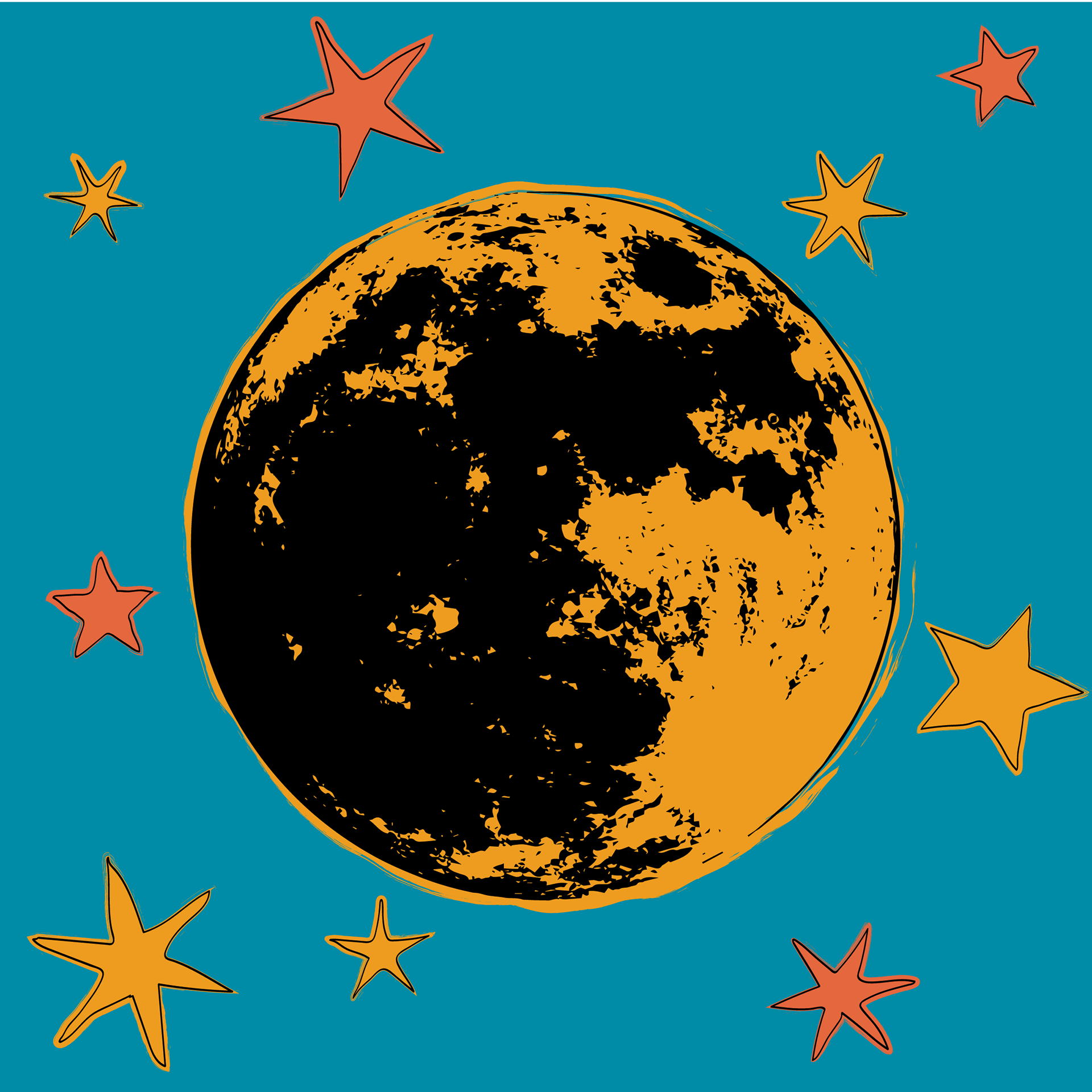
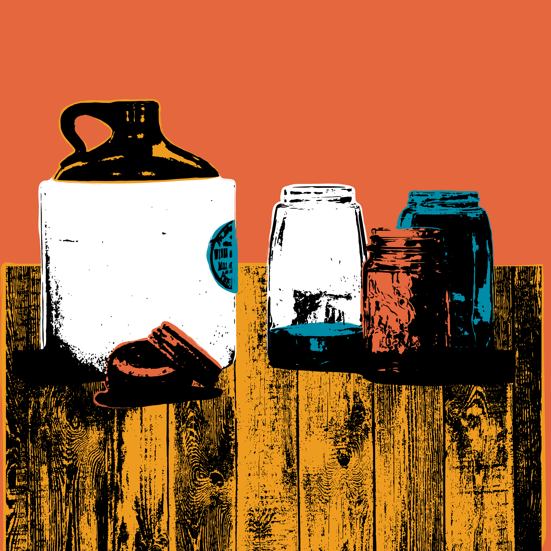
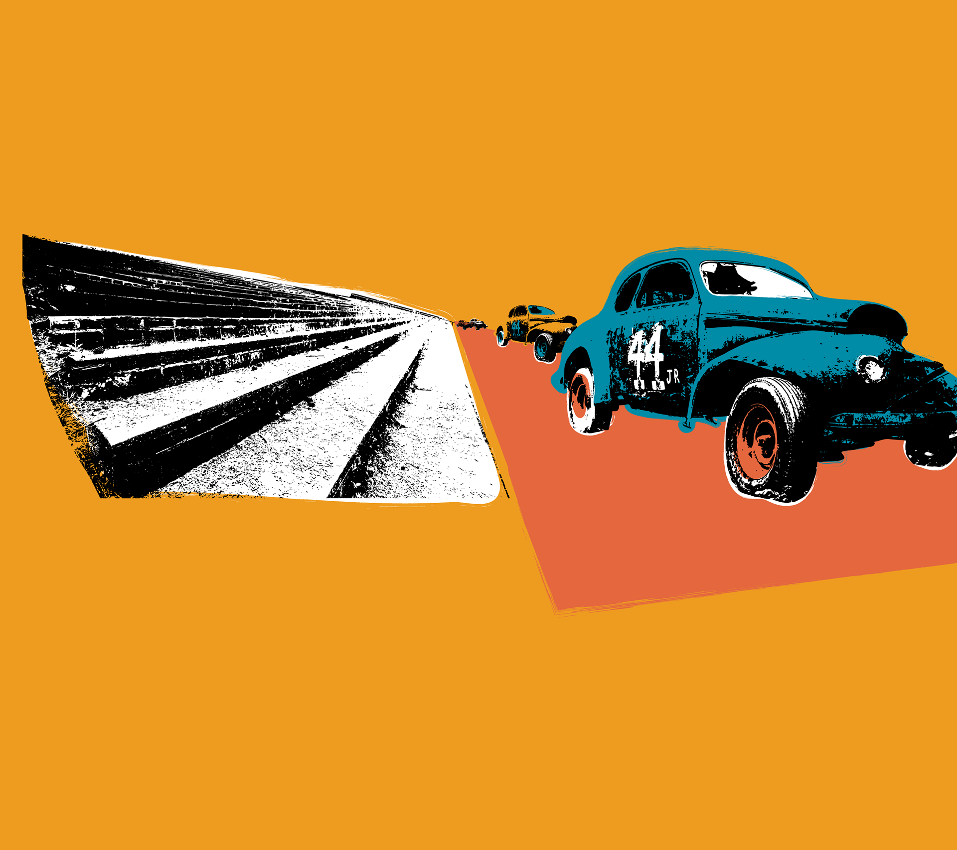
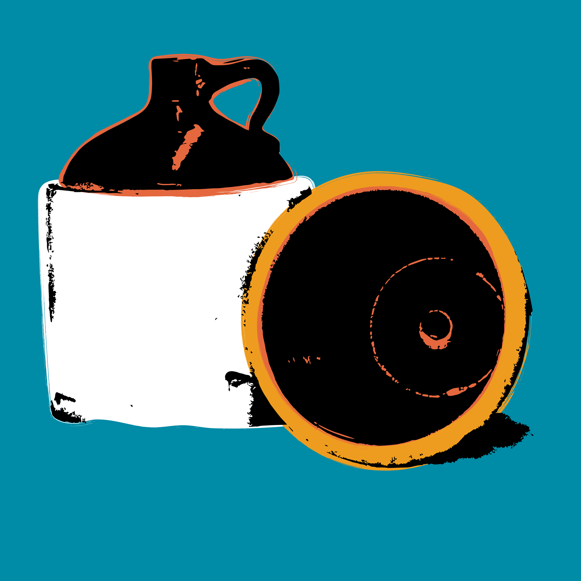
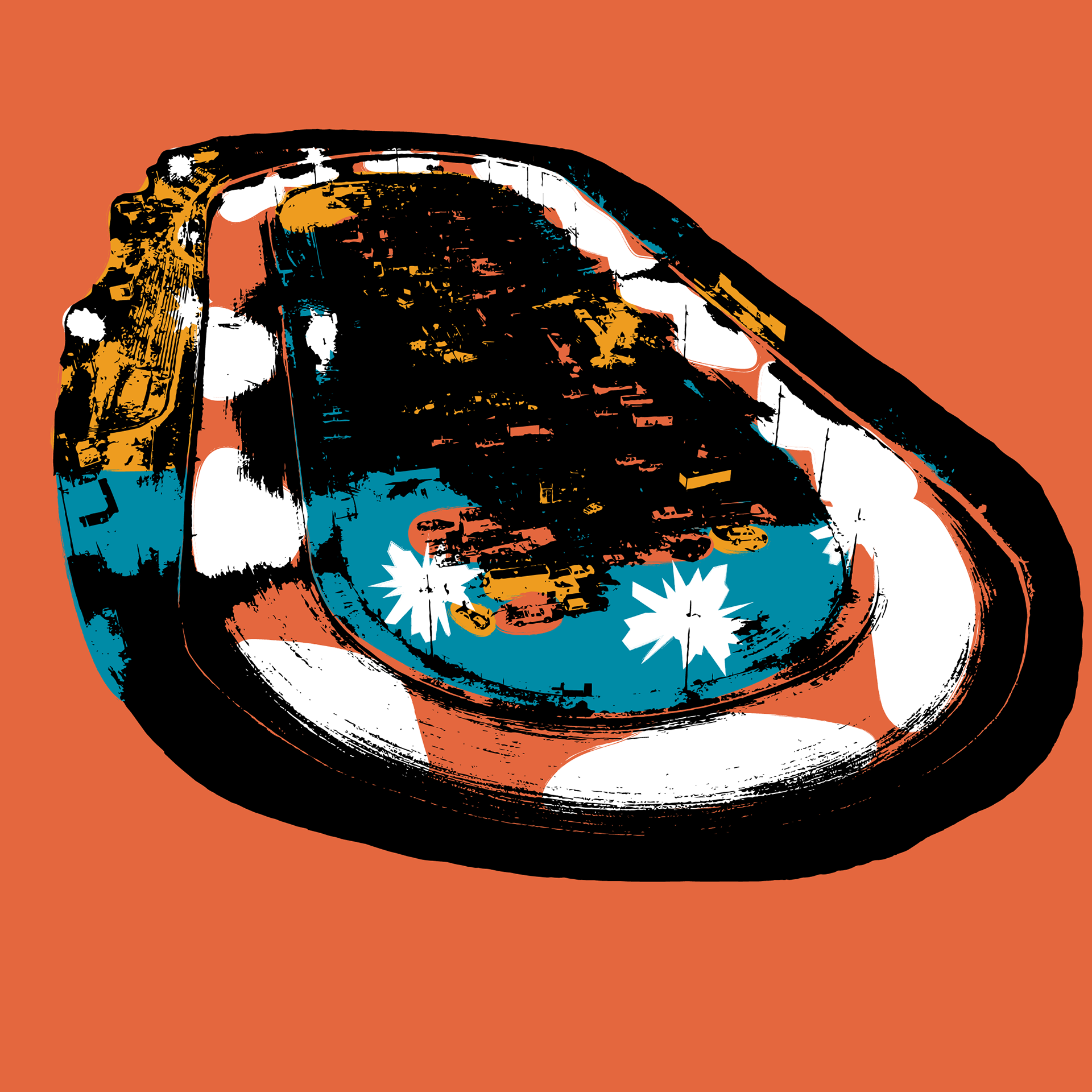
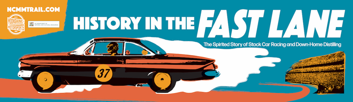
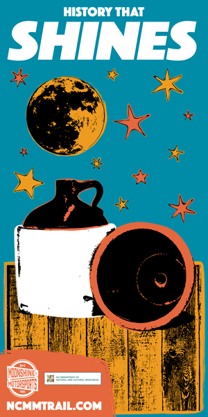
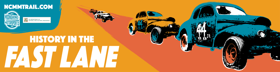
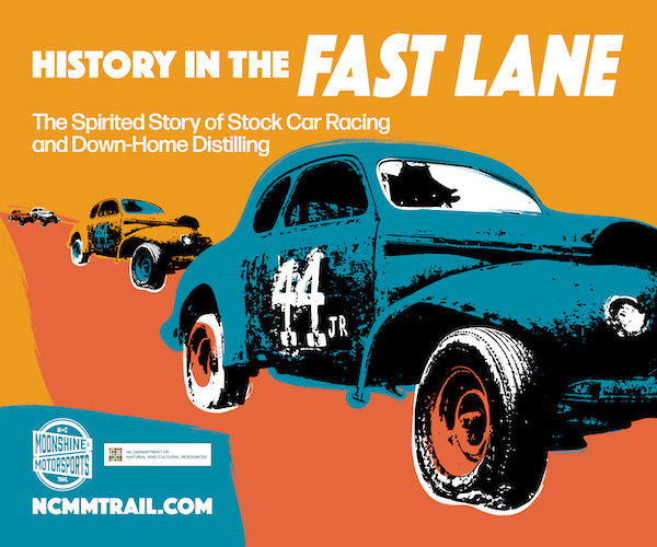
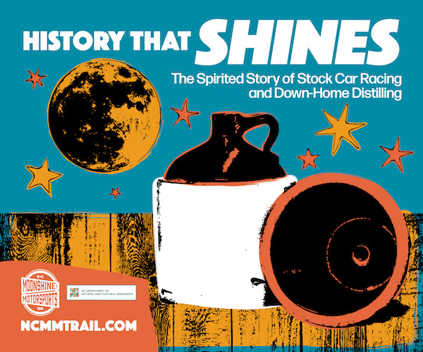
I decided on a branding design inspired by Andy Warhol's famous series of silkscreen prints. The DIY, grungy aesthetic of those screenprints evokes the same spirit and ethos that many of the early moonshiners and stock car racers had. I kept a loose continuity to the silkscreen designs in order to have flexibility in adding or removing design elements and adjusting the overall composition to suit the aspect ratio constraints of whatever application they were being designed for.
The silkscreen design was conceived in Photoshop but ultimately created in Illustrator, since having vector images would provide greater flexibility of use. In addition to vector images, historic and contemporary photographs were provided by the state archives. The black and white photos were colorized in Photoshop, and an antiquing preset was created in Lightroom and applied to color photography so that the brand color palette was consistent and to also instill the disparate photo collection with a sense of timelessness and harmony.
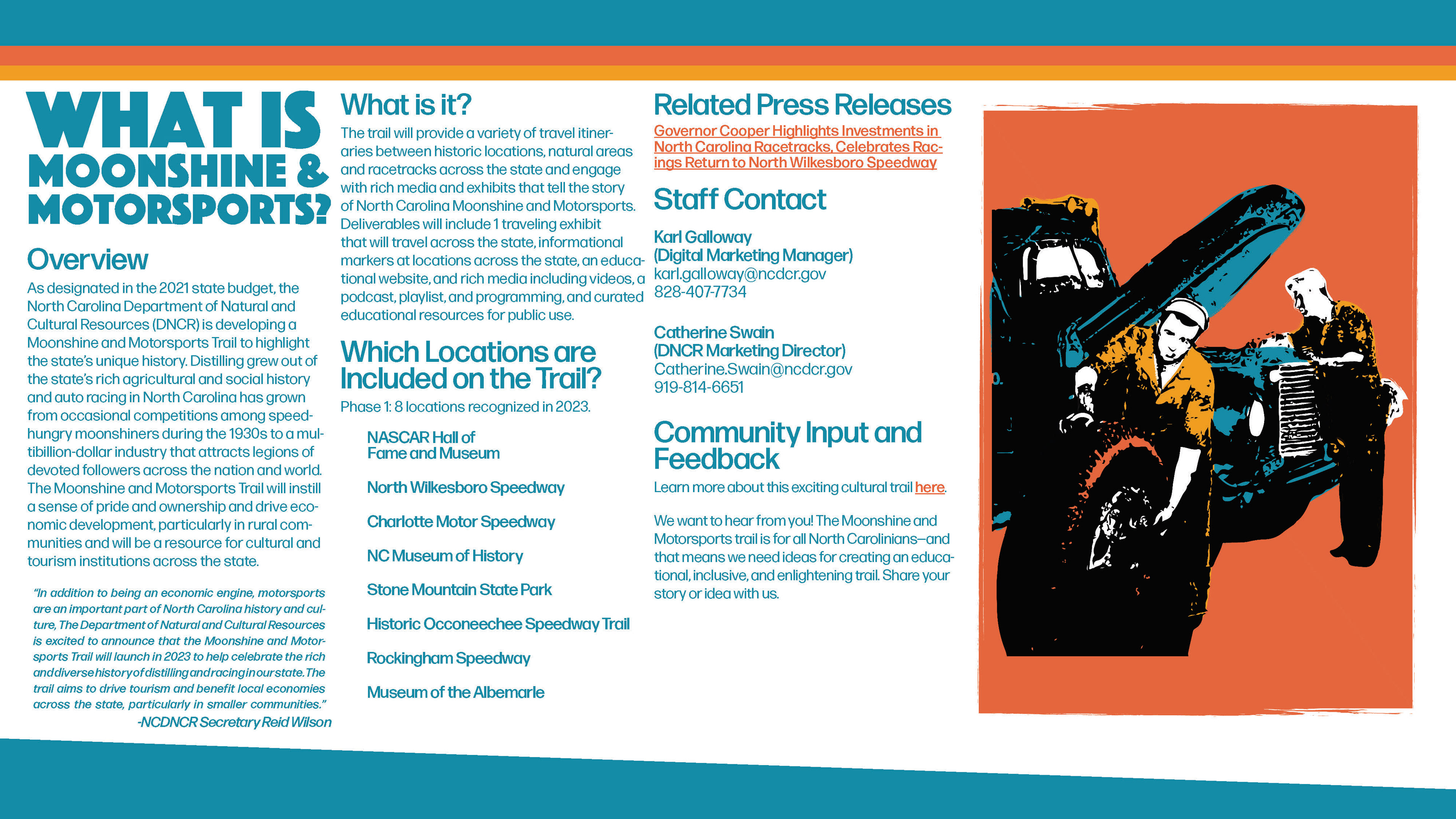
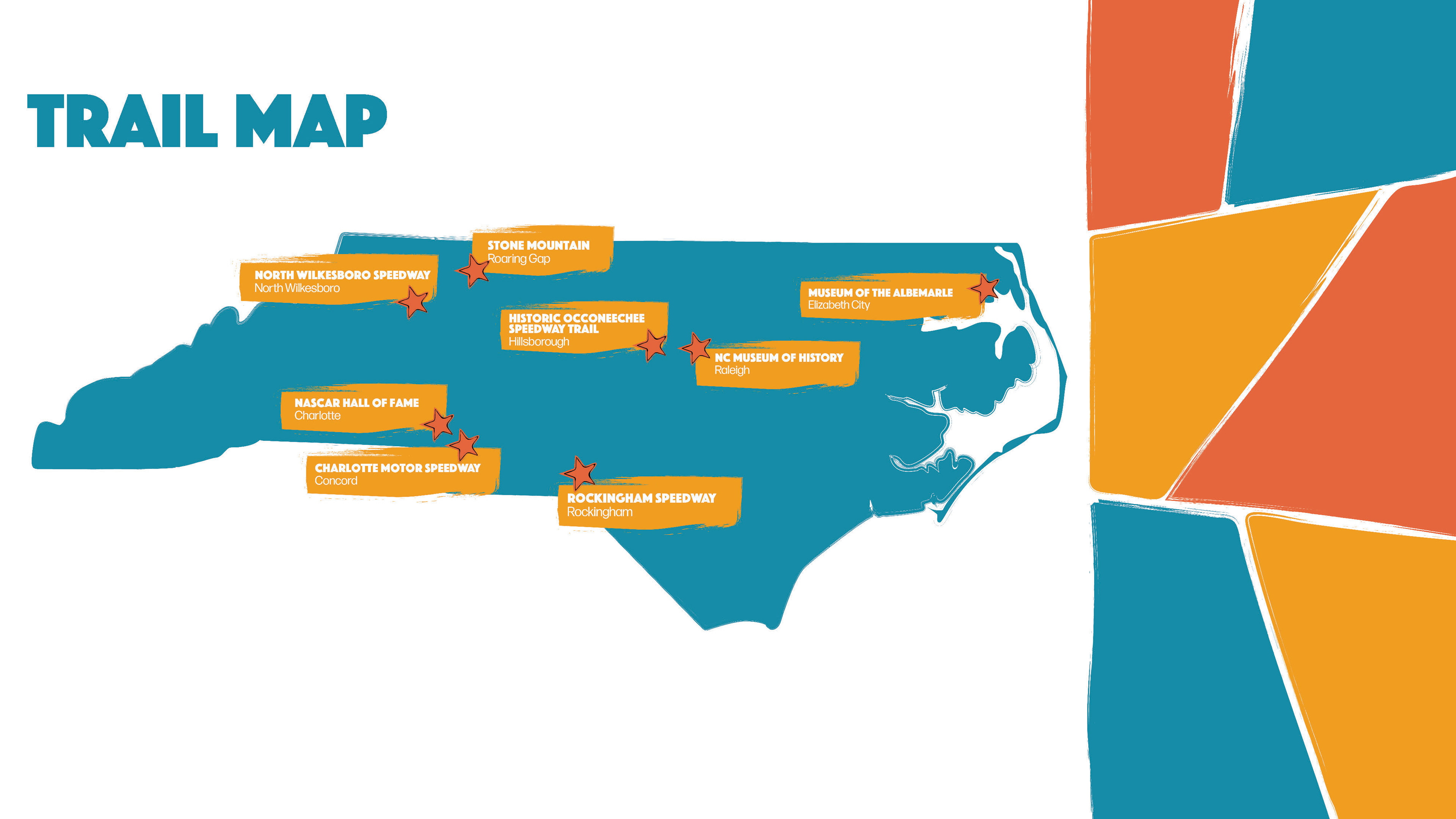
A tool kit was created, which served as the branding guideline for the deliverables to come. This digital 'booklet' lists the general outline of the project goals, the locations highlighted on the cultural trail, and links to other branding resources useful to hopeful participants.
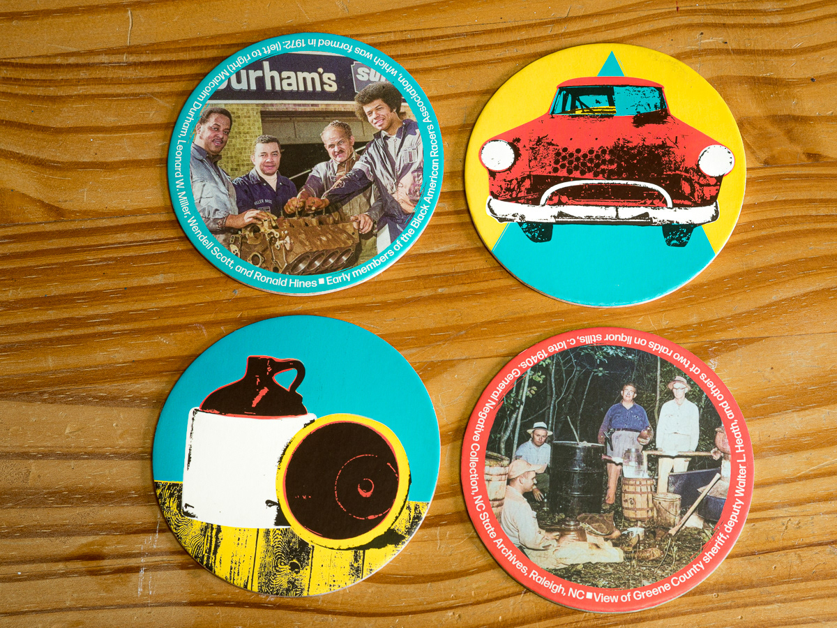
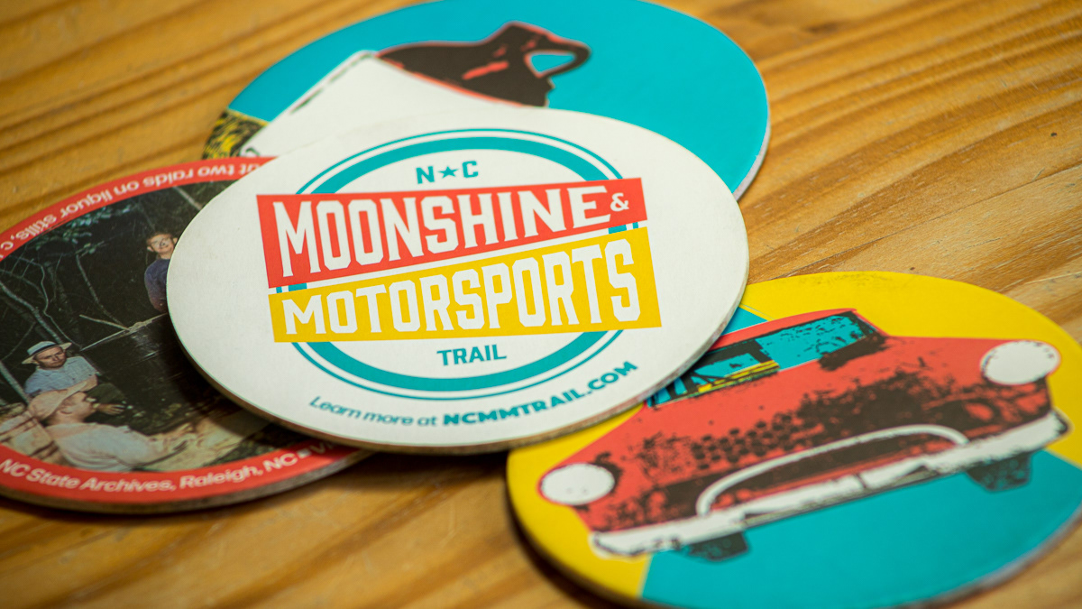
Swag included trucker hats, keychains, and coasters. The coaster was designed as a 4 piece collection using one screenprint design and one historic photograph with description to represent either moonshine distilling or stock car racing.
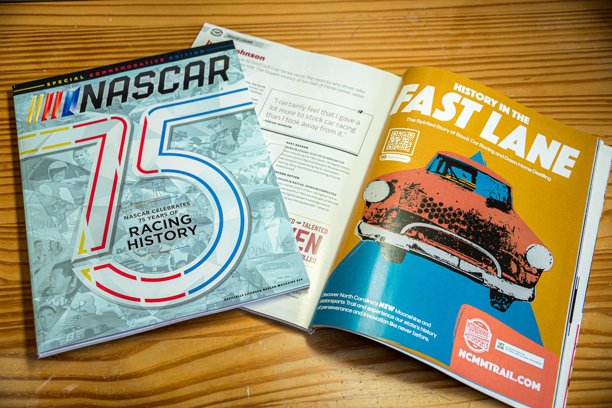
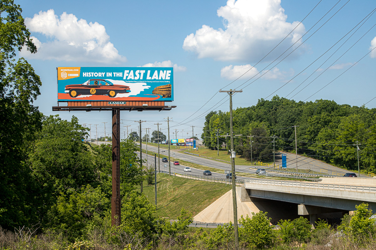
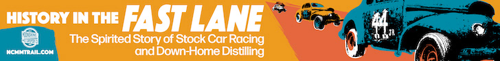
Print deliverables included ads for local publications, commemorative markers to be erected at important points on the trail, and panels for a traveling exhibit (The markers and traveling exhibits were managed by another designer). Additionally, billboards were designed to be placed near important historic stock race courses in North Wilkesboro, Rockingham, and Charlotte. Two designs for the billboards were created, one design representing each subject, since two billboard locations were chosen for each location.
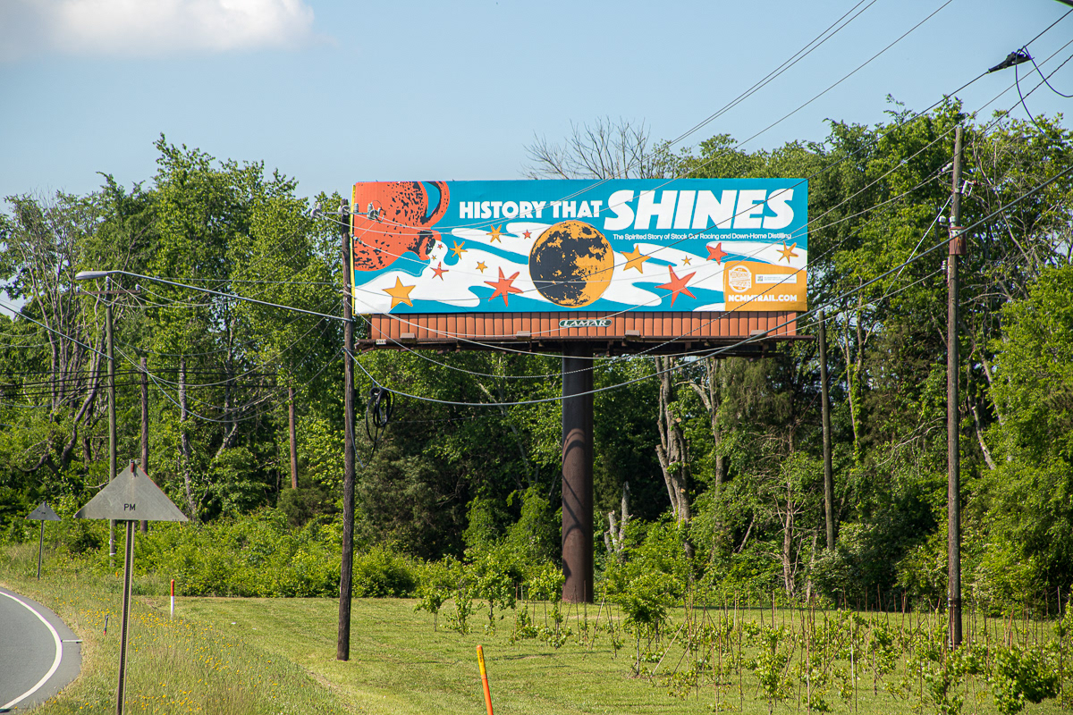
Moonshine Billboard near Charlotte Motor Speedway in Concord, NC
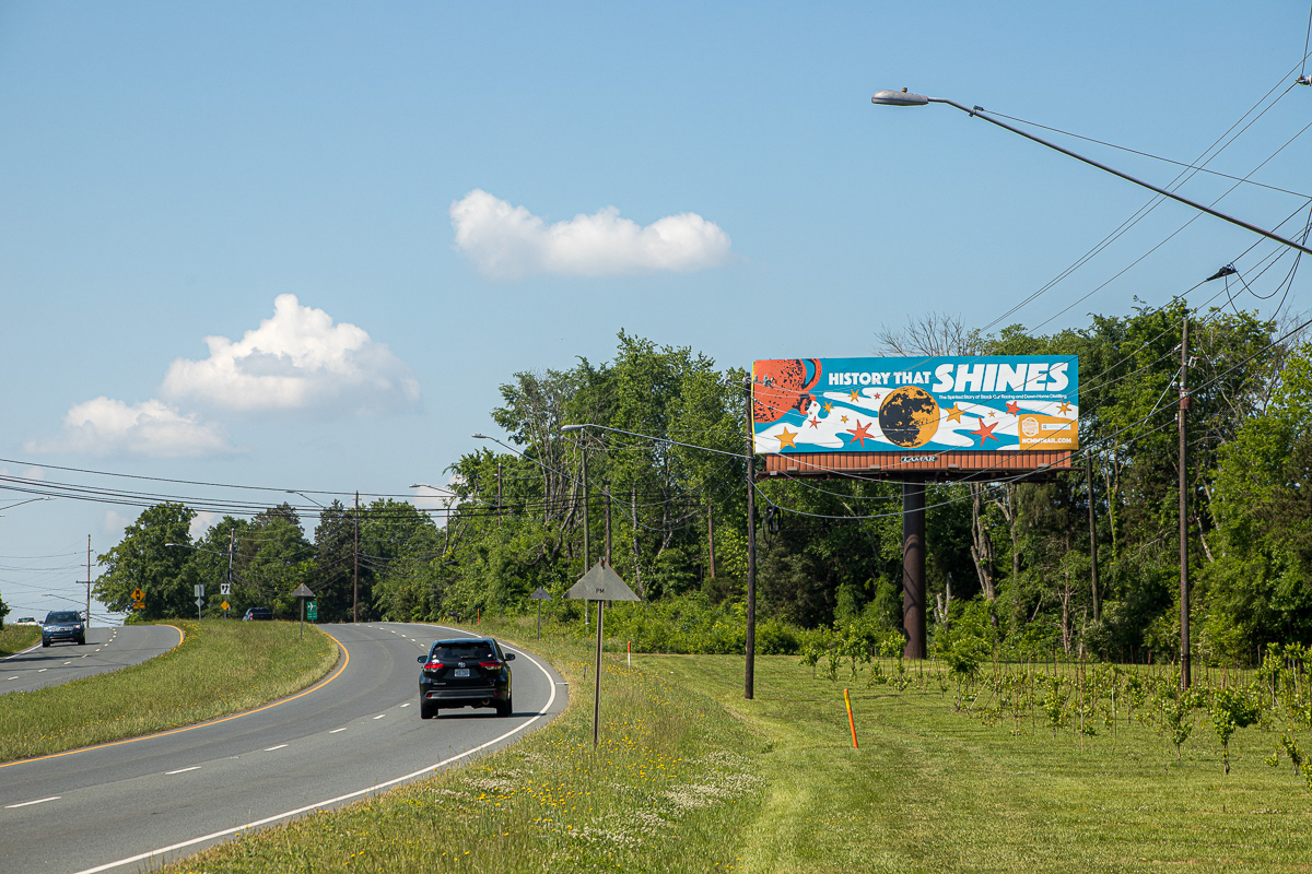
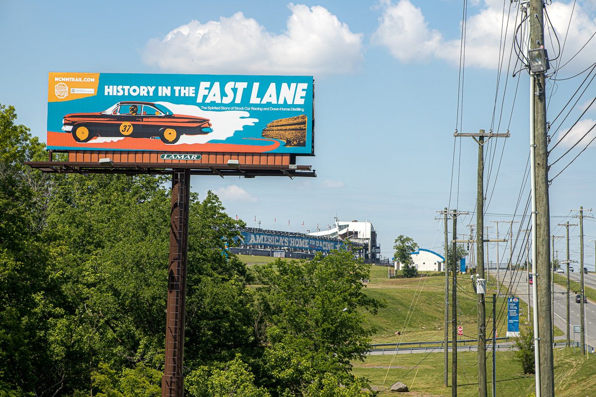
Motorsports Billboard outside Charlotte Motor Speedway in Concord, NC
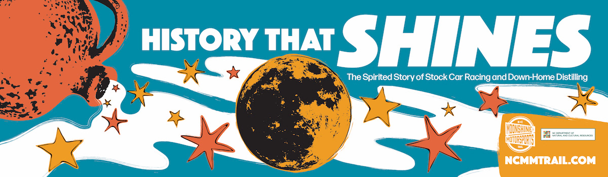
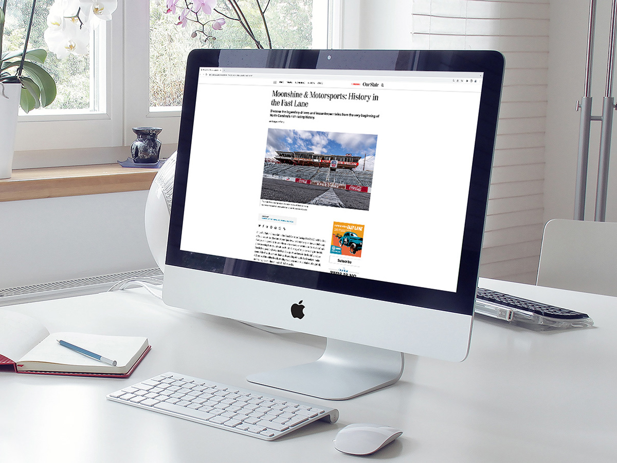
A collection of digital ads was also created.

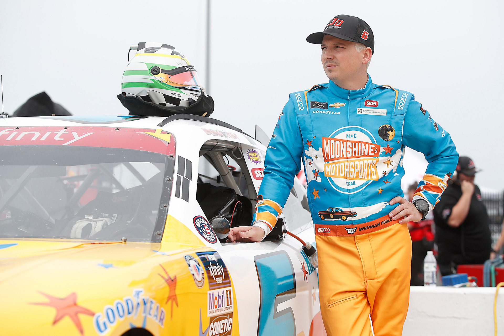
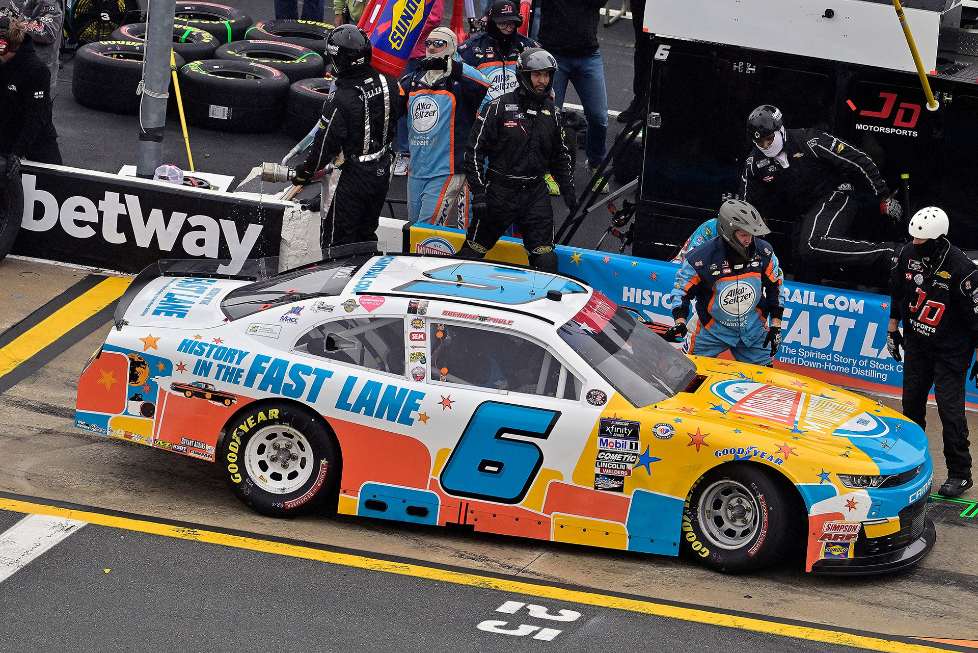
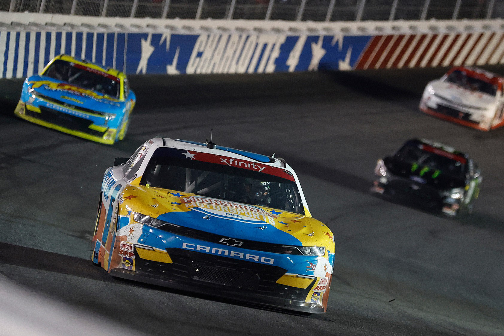
DNCR also sponsored a race car that ran in the NASCAR Xfinity Series Alsco Uniforms 300. The design package was handled by an outside design firm using the branding assets I created.